New York City’s Design Future
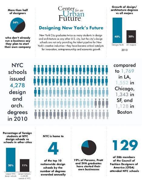
New York City’s design and architecture sector shows a lot of opportunity for innovation and economic growth. This infographic from the Center for an Urban Future looks at the number of designers in the city who plan to start their own companies, how many design and architecture degrees were issued compared to other cities, and how many top fashion designers attended a NYC school.
Constellations of Happy and Sad
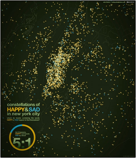
According to this graphic, New York City is a happy place to be. Happy people outweigh sad people 5:1 according to an analyzation of tweets expressing a positive or negative sentiment.
Modern Day Segregation in NYC
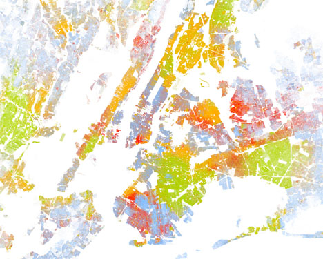
It may not be forced anymore, but racial segregation is still a reality in many cities, including New York. This map shows one color-coded dot per person in the city, with blue for white people, green for African Americans, red for Asians and orange for Latinos. Areas that appear purple are actually mixed black and white neighborhoods when viewed more closely.
New York City’s Open Data Trove
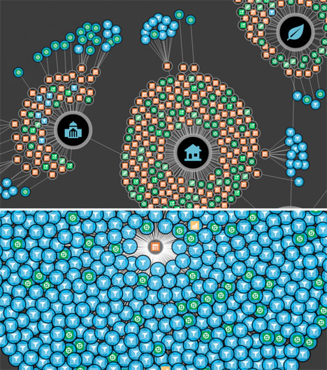
Find all of the publicly available data on your specific neighborhood with this interactive map from the NYC Open Data Initiative, which explores things like school test scores, court districts, social services, homelessness and parking availability.