London Vs. New York City
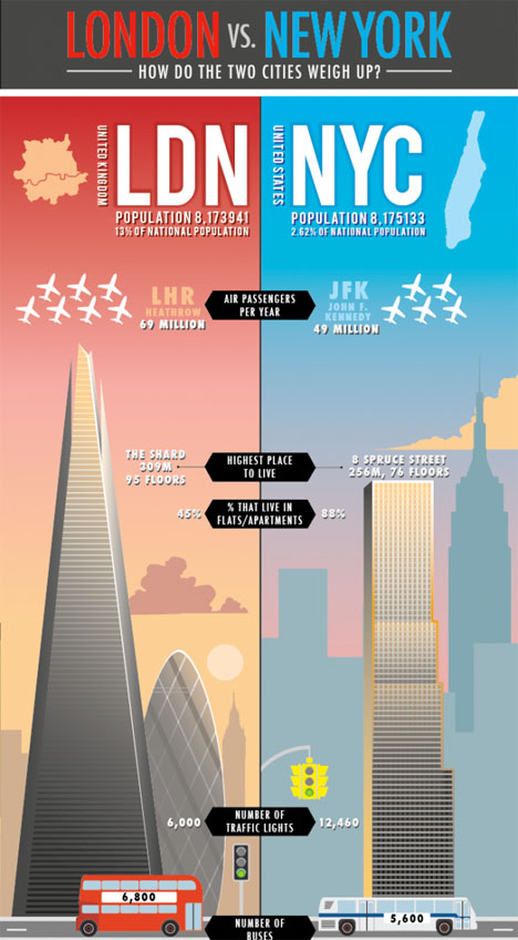
How do the cities of London and New York City compare? This infographic takes a look at air passengers, the highest places to live, average rent price, commuting time and other data.
The Pulse of New York, via Foursquare Data
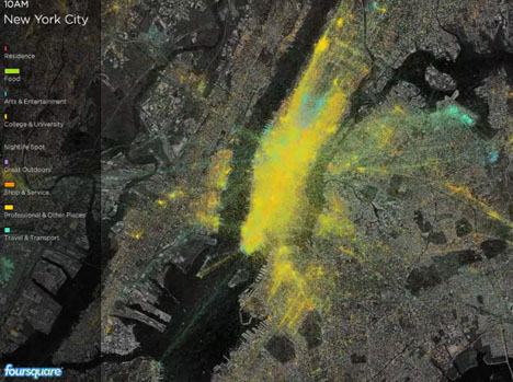
The massive amount of data collected by Foursquare is put into use to show the pulse of various cities, including New York. The company took a year of check-in data and condensed it by city to show what each location looks like on an average day. It shows not just where people are, but when and why.
Reshaping New York: The City’s Changes Over 12 Years
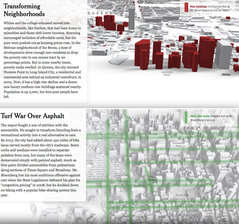
How did the city change during Michael Bloomberg’s tenure as mayor? This interactive infographic lays it out, including bike lanes, new buildings, rezoned areas and more – take the tour at The New York Times.
Topographic Income Inequality Maps
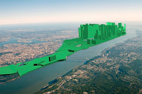
Another income inequality visualization gives us this data on a topographic map, with the poorest areas being flatter and the richest rising into the sky like the city’s tallest buildings.
Neighborhood Gender Gaps
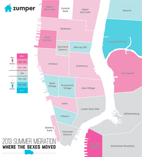
Why would women prefer some condos and men prefer others? Interpret this infographic as you will – it shows where the sexes moved over summer 2013 in New York City.