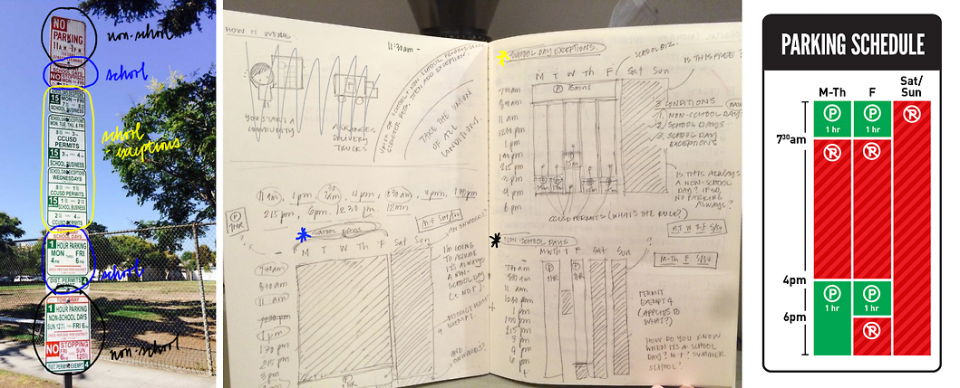
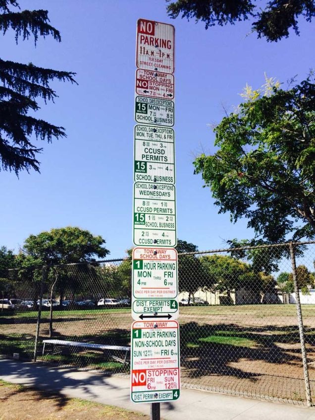
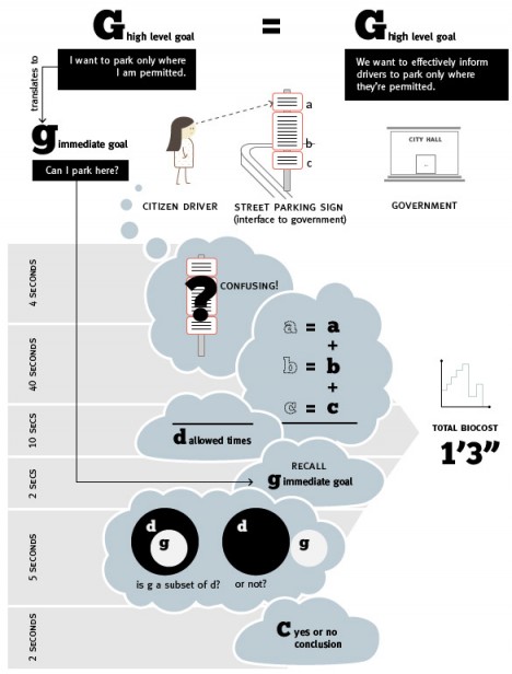
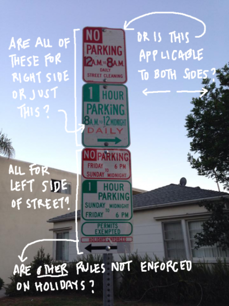
Anyone who has parked in a major metropolitan area has seen something like this: a vertical array of signs that provide a confusing (sometimes even self-contradictory) instructions about when you can park based on time of day or year, type of permit and other conditions.
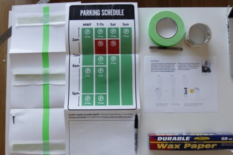
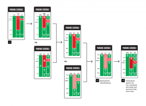
Nikki Sylianteng, having gotten one too many parking tickets, decided to do something about the problem, developing, refining and ultimately deploying a solution on the streets to get actual feedback.
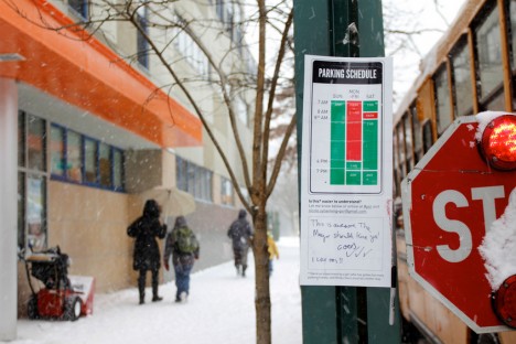
Titled To Park or Not to Park, this ongoing project started as an independent and informal attempt to see if there were better options out there but has since progressed to a council motion in Los Angeles to test such signs in a more official capacity.
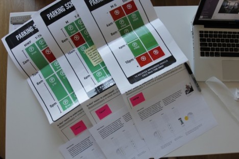
For additional feedback, Nikki has sent copies of the modified signage to people in other parts of California and Minnesota to see how they fare in different cities and settings.
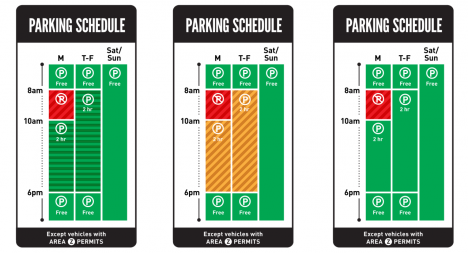
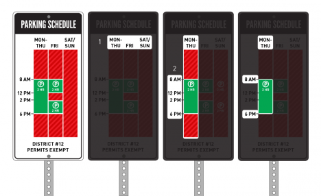
Combining various signs into one, the time is presented along the y-axis and the date on the x-axis. Green bars indicate acceptable times to park and red bars are used to indicate otherwise. Sometimes additional complexity needs to be addressed when permits come into play or the school year is factored in the mix (not always corresponding just to days of the week).
From the project’s creator: “My strategy was to visualize the blocks of time when parking is allowed and not allowed. Everything else was kept the same, the colors, the form. My intention was to show how a small but thoughtful change can make a big difference by save drivers a lot of time, stress, and money. I tried to stay mindful of the constraints that a large organization like the Department of Transportation might face for this seemingly small change.”
