Mirador Building, Madrid, Spain
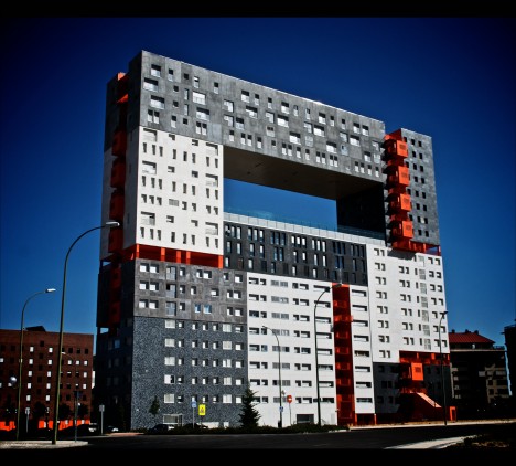
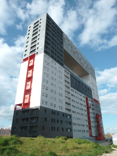
Known for its imaginative innovation, architecture firm MVRDV has always been divisive, but the Mirador Building is a miss simply because it’s got virtually no aesthetic value. The jumble of window shapes and colors and utter lack of symmetry make this building seem as if it was constructed out of leftover parts from other projects.
Fang Yuan Building, China
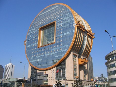
The coin-shaped Fang Yuan Building in Shenyang was meant to be a landmark, and that it is, but mostly because its clunkiness stands out so starkly among the rest of the buildings in the area.
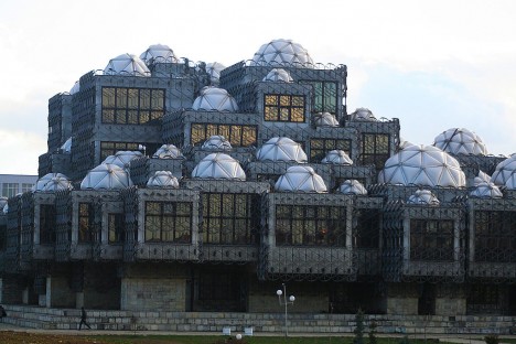
National Library in Pristina, Kosovo
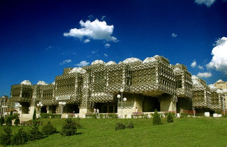
Kosovo’s national library stands as proof that when you put a bunch of attractive elements together into one package, you don’t always get an attractive finished project. The architect blended Byzantine and Islamic architectural forms with a modern sensibility for an overall effect that’s simply weird.
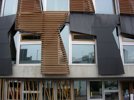
Scottish Parliament Building, Edinburgh, Scotland
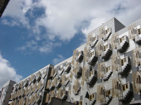
Inspired by an iconic painting by Henry Raeburn called ‘The Skating Minister,’ the distinctive windows on the Scottish Parliament Building in Edinburgh are unique, to say the least, but these unnecessary decorative flourishes are just the tip of the iceberg when it comes to the building’s problems. Since it was built in 2004, Scottish taxpayers have spent over $16 million to maintain and repair it, as pieces keep falling off inside and out.
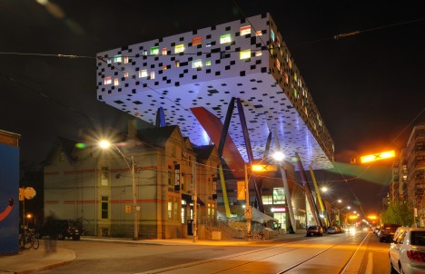
Sharp Center for Design, Toronto, Canada
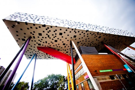
A big white pixelated box rises on colorful pillars to form a canopy among the traditional buildings at the Ontario College of Art and Design. Meant to emphasize the mix of Victorian and modern architectural elements in the area, the contrast is ultimately cartoonish, demonstrating a complete lack of subtlety and nuance.
