Aside from outliers like Adidas, which acquired its logo for a few thousand dollars and two bottles of booze, big brands often spend millions (or more) on logo design, but how memorable are the results?
“The logos of global corporations like Apple, Starbucks, and Foot Locker are designed to create instant brand associations in the minds of billions who see them every day,” explains Signs.com “But how accurately can we remember the features and colors of these famous symbols?”
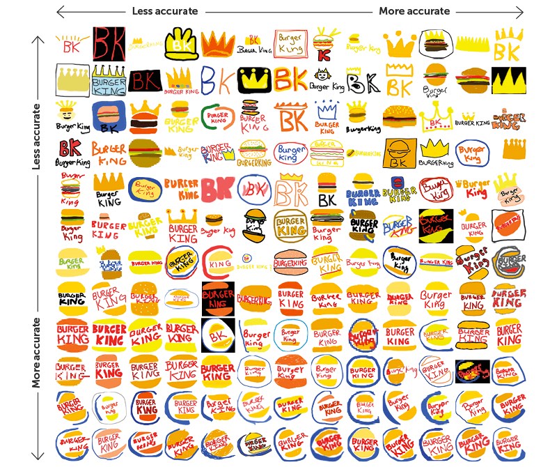
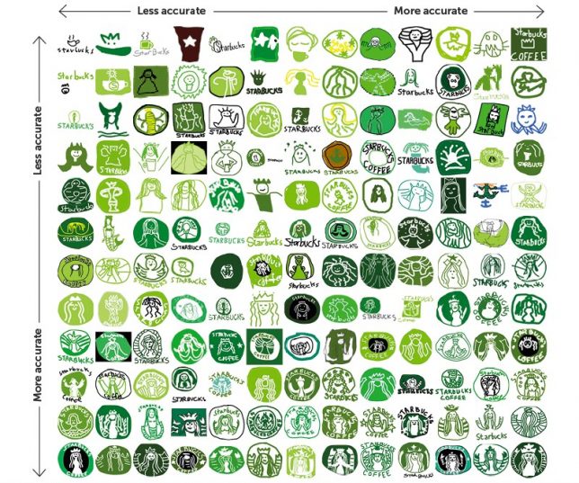
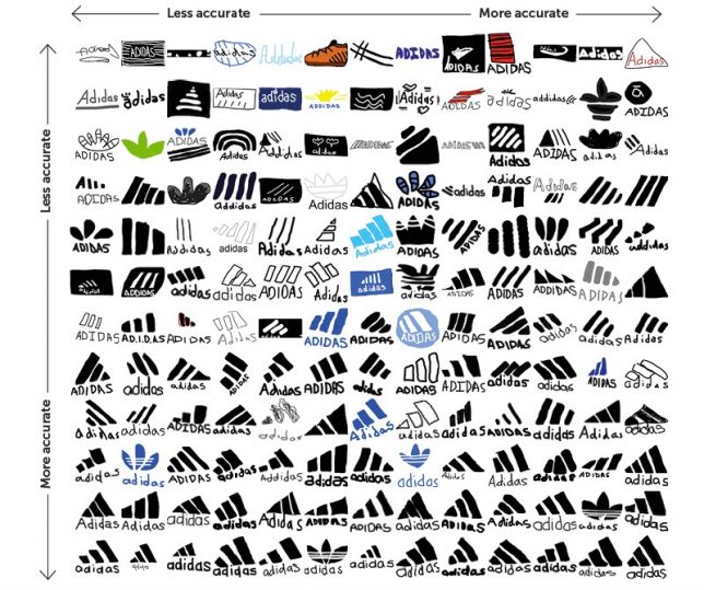
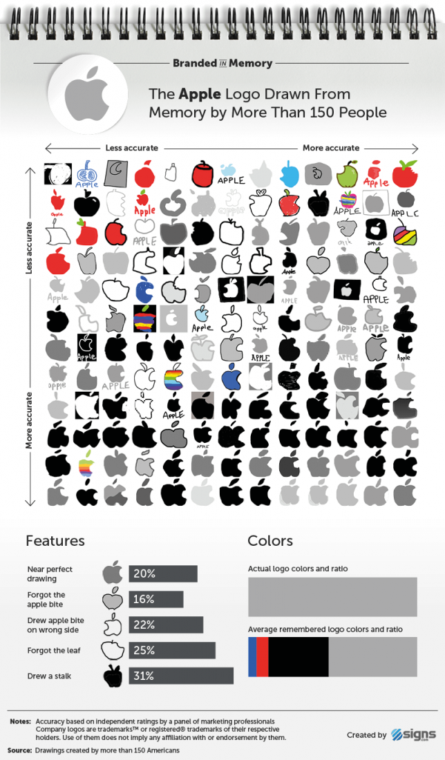
They then polled 150 Americans to draw 10 logos each and evaluated the collective memory of those participants. Results ranged from inaccurate blobs to highly detailed drawings. In some cases, participants missed the mark, but the overall recall was surprisingly good.
Lots of interesting details arose from the analysis, like the natural propensity of some participants to add a stalk to the Apple logo or draw on aspects of earlier versions rather than the present iteration. One might think with its ubiquitous product placements it would be immune to such mistakes, but no. Dominoes, 7-Eleven and other iconic brands were also included in the experiment, as well as detailed analysis of each logo’s evolution.


