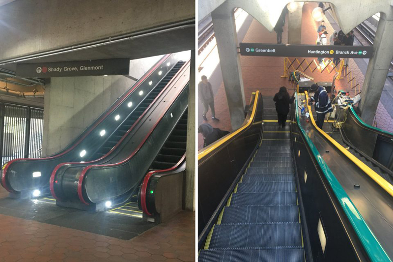
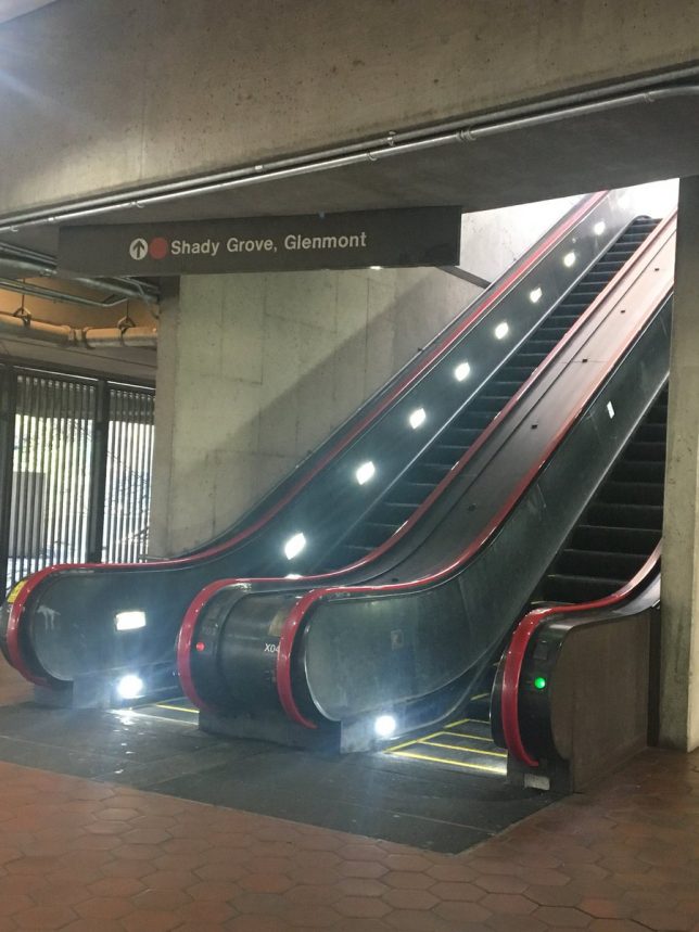
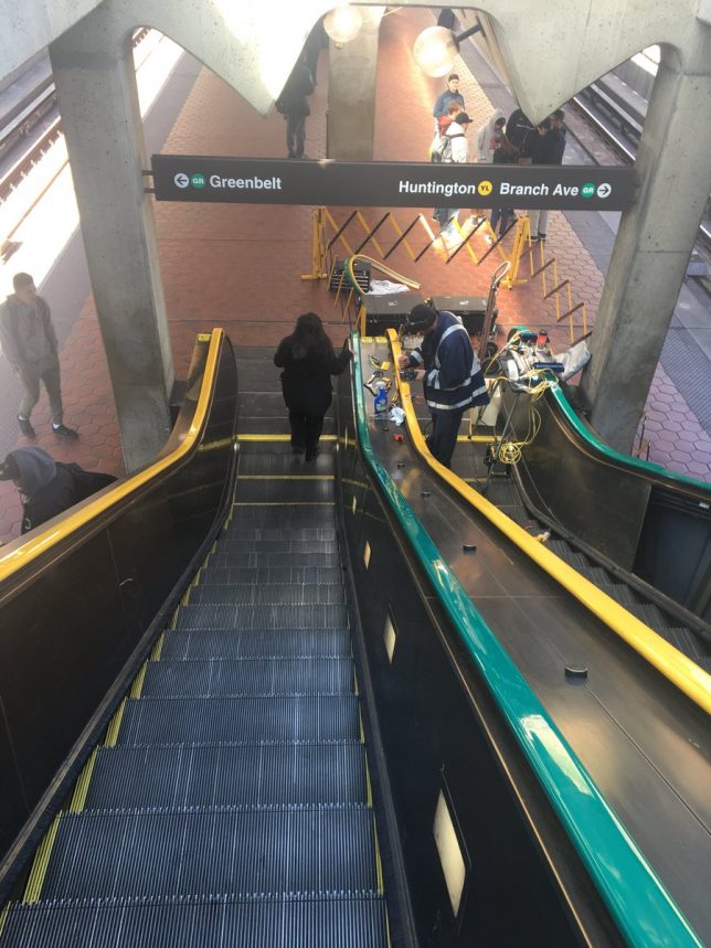
The Washington Metro Transit Authority has quietly rolled out a simple but ingenious wayfinding solution: colored escalator railings to guide passengers to their trains. Graphic designer Jen Scharl spotted the new colored rails Fort Totten. There’s no word yet on other stations — for now this is a test, but it is relatively cost-neutral so it might also be ohe beginning of a new WMATA design strategy. The ones so far deployed appear robust — the colors are embedded, not just painted on.
Of course, using colors, symbols and numbers to guide people through stations is nothing new, but anyone who has rushed between levels to transfer trains knows that these aren’t always easy to spot. Plus, color systems are helpful to people who can’t read the text signage for whateve reasons.
Sometimes, finding a sign takes a few seconds, leaving one looking around at the top (or bottom) of an escalator — now, transit users can simply follow the colors. Colorblind passengers will, of course, still have to rely on conventional signage, but perhaps there is a future iteration of this strategy (yet to be designed or deployed) involving symbols as well as colors.
Systems that have been in place for a long time often get overlooked when it comes to wayfinding innovations — aside from periodic guerrilla interventions, locals know what to do and expect others to figure it out on the fly, so it’s nice to see a proactive new solution playing out in an old context.


