Brutalism may be concrete architecture’s highest historic form, but the material is as versatile as we make it, and it’s got a lot more tricks up its sleeves. Though we may think of it as cold, heavy and solid, these 10 projects ranging from rocky pavilions and airy sculptural memorials to museums that look like they’re made of folded paper show off just how sculptural concrete can be in the hands of an innovative designer.
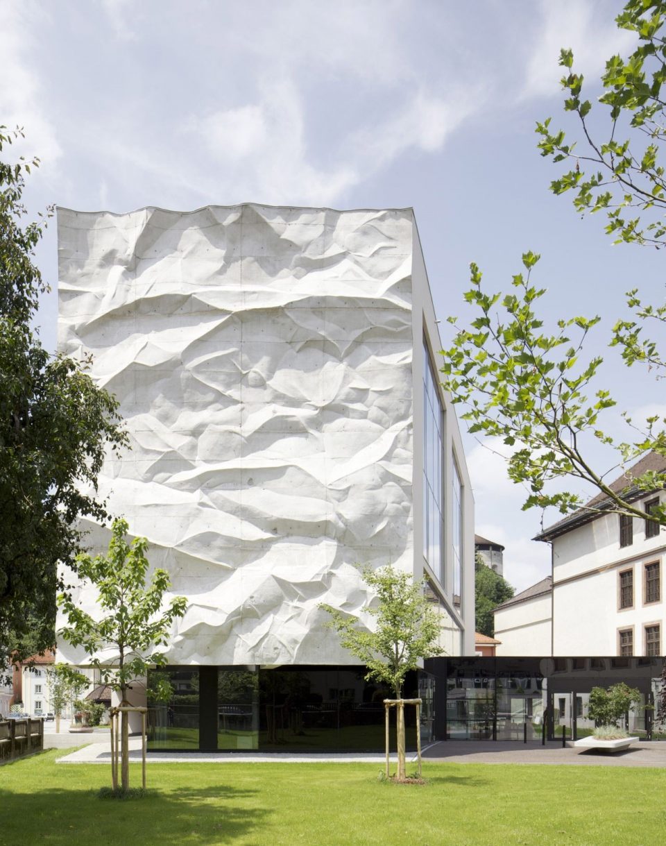
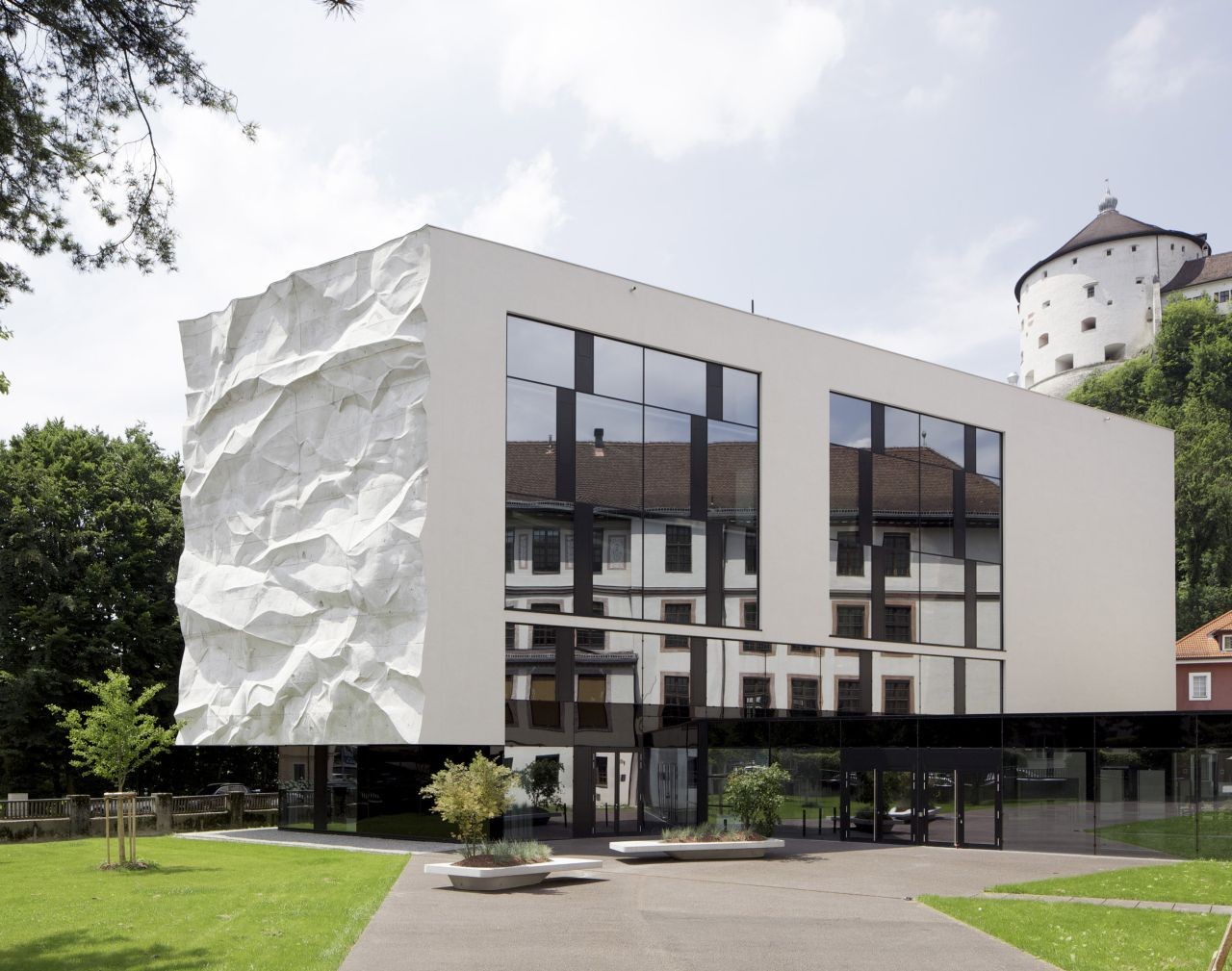
Crinkled Texture: High School by Wiesflecker Architecture
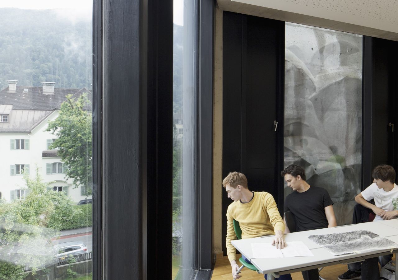
Set outside a historic high school in Austria, this new, independent building by architect Johannes Wiesflecker stands out for a number of reasons, including the way its modern form contrasts with the older complex behind it. But most eye-catching of all is its dramatic ‘crinkled’ shear wall, hanging about 8 feet in front of a glass facade. The wall is actually a three-dimensional structure in itself, almost like a sculpture that stretches from the roof down to the first floor, and can be viewed from inside as well as out.
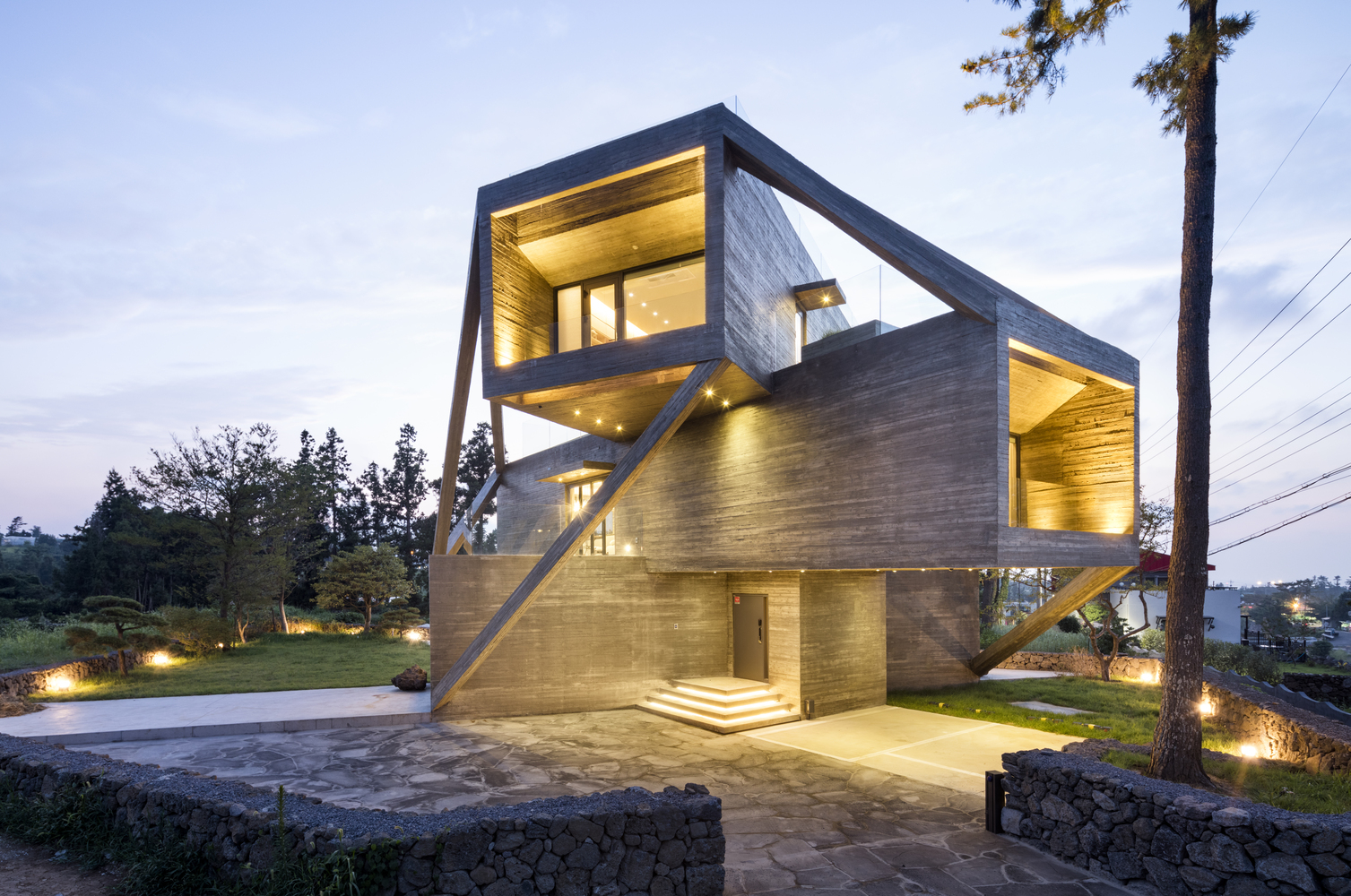
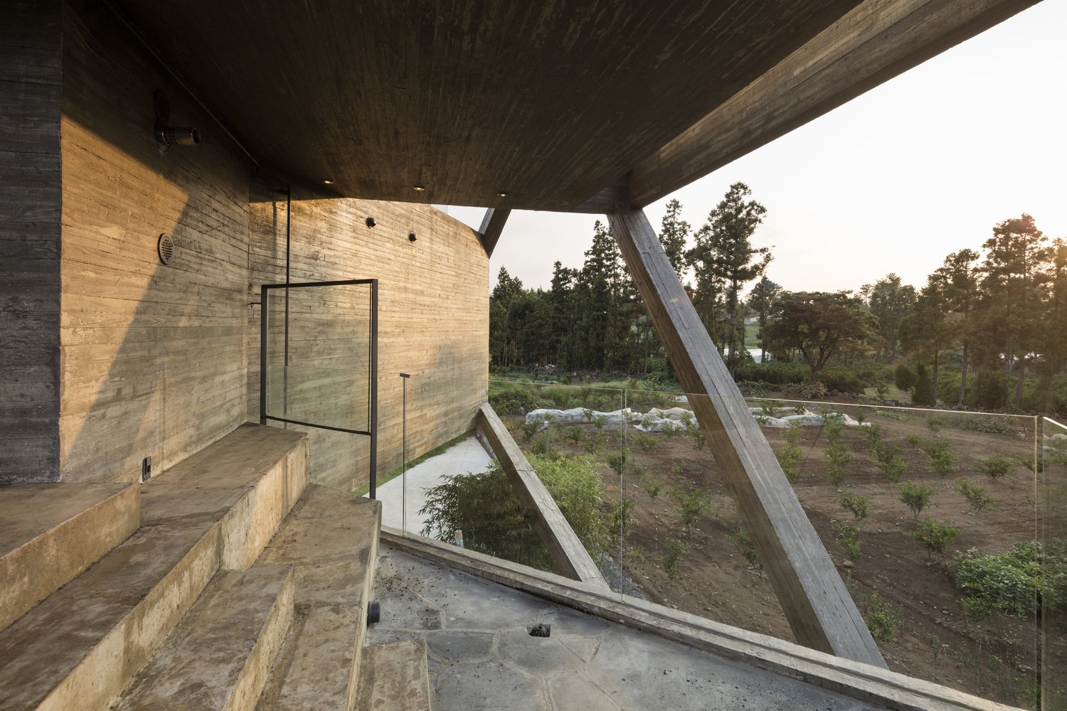
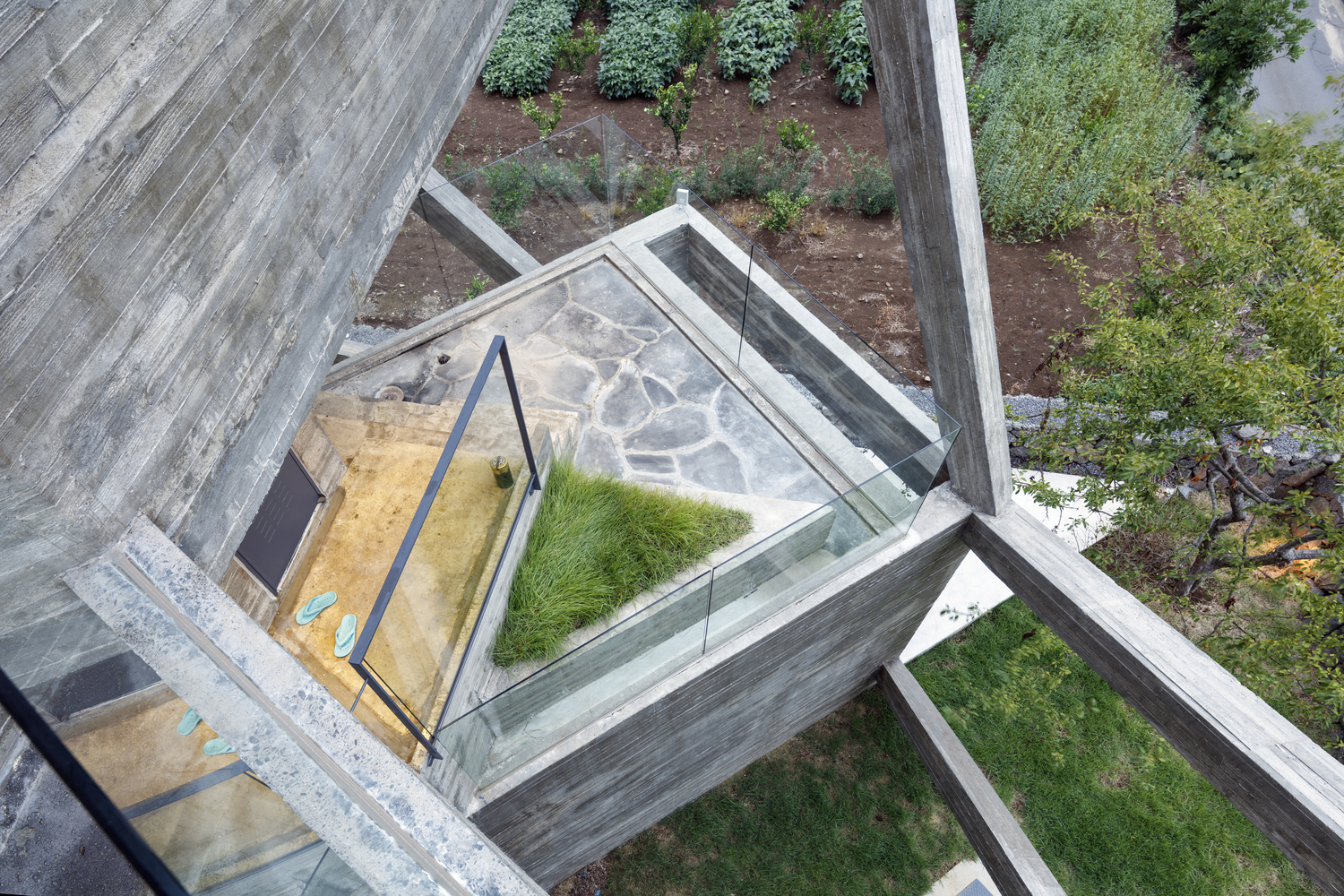
Dynamic Angles: Simple House by Moon Hoon
For a home on a windy island in Korea where “weather is the ruler,” architect Moon Hoon needed materials that would provide bunker-like security while also offering a welcoming space to get away. Though his first solution was to sink the home into the ground, the clients wanted something more showy and extravagant. The final design stacks volumes of concrete in a criss-crossed fashion and attaches them together with slim concrete connectors, allowing the wind to flow through the structure. The result feels surprisingly dynamic for a material often associated with heavy, static solidity.
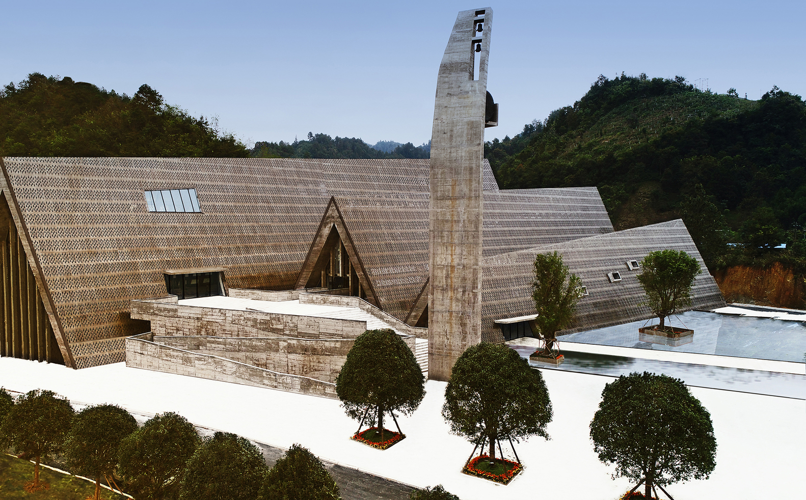
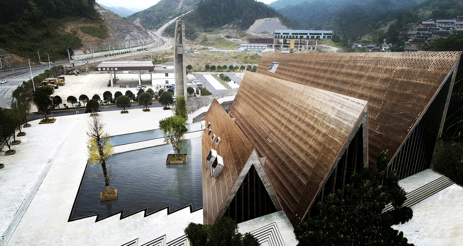
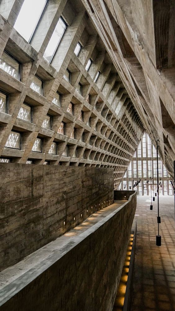
Surprising Shapes & Airy Textures: Shui Cultural Center by West-Line Studio
A latticed formwork of concrete acts as the base of a single zig-zagged roof enclosing the Shui Cultural Center in China, celebrating one of the country’s minority ethnic groups. Its shape pays homage to their language, following the shape of the character for ‘mountain,’ while the pattern of the perforated bronze steel plates of the roof takes inspiration from the Shui’s traditional characters. Architecture firm West-Line Studio wanted the thin metal sheathing to contrast with the heaviness of the concrete, which reveals itself in the building’s interiors.
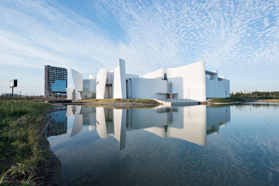
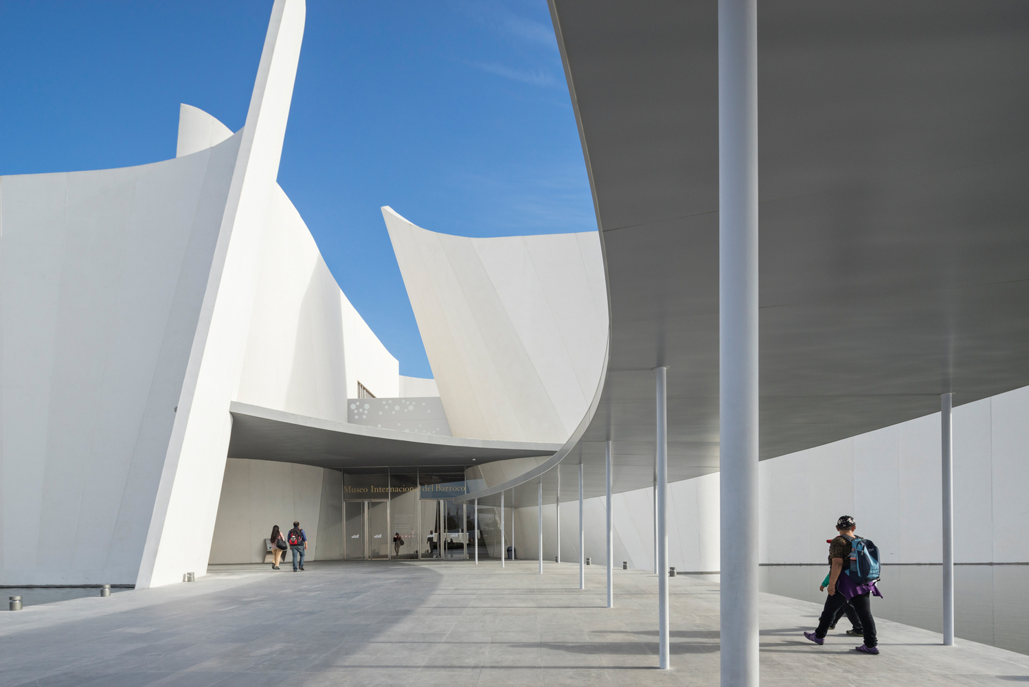
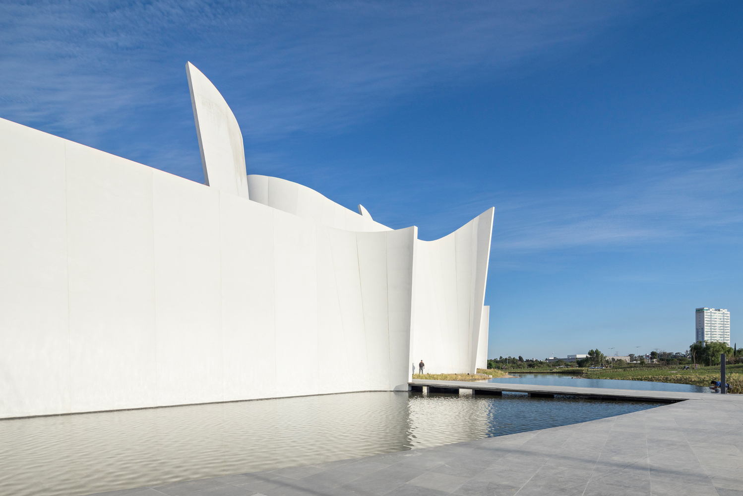
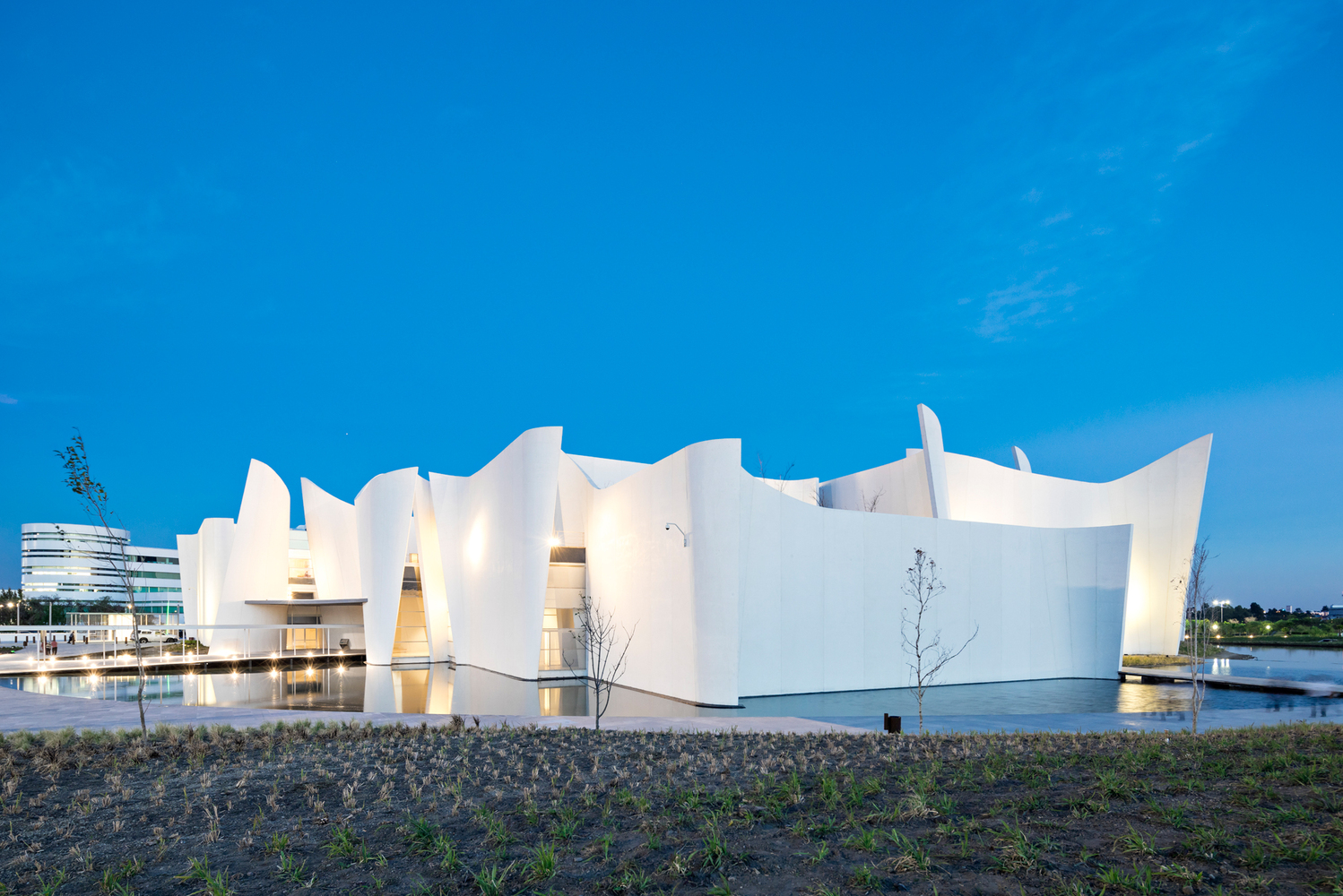
Thin, Curving Walls: Museo International del Barroco by Toyo Ito & Associates
The thin, curving concrete walls of Toyo Ito’s Museo International del Barroco almost look like they’re made of paper, a quality rarely seen in this material. The firm worked with the Mexican company DANSTEK, which specializes in precast concrete, the develop the concrete walls and slabs which are precast on the exterior and cast in-situ on the interior. Those walls aren’t just decorative, either. They’re load-bearing, and integrated into a structural strategy that gives the building earthquake resistant qualities.
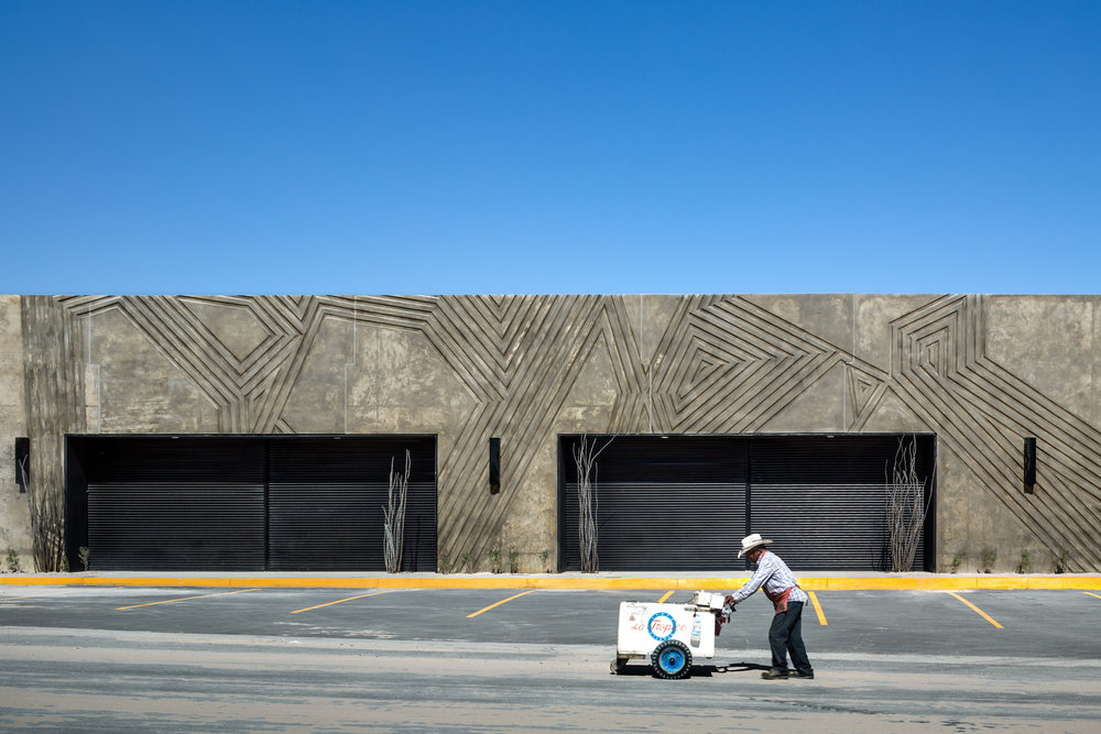
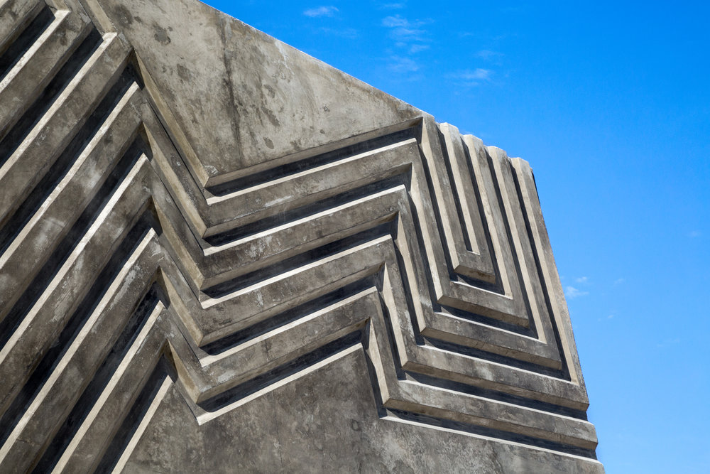
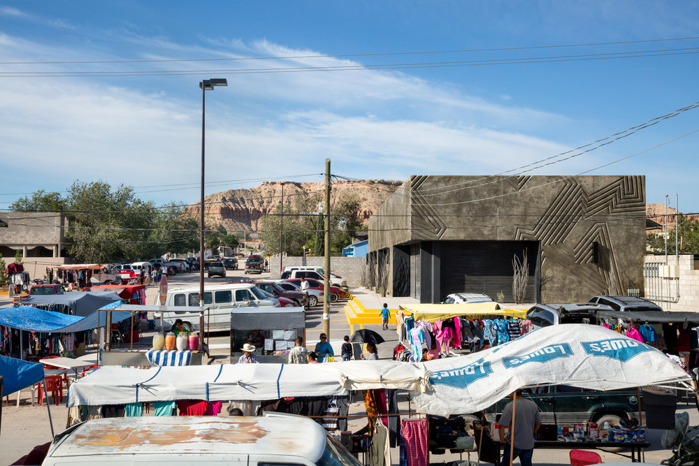
Carved Concrete Designs: Commercial Building by Jorge Urias Studio
Once you get a look at this low-cost commercial concrete structure in Juarez, Mexico, you wonder why we don’t see designs embedded into similar buildings more often. It seems sort of obvious, doesn’t it? Yet decorative and artistic touches are typically left off in favor of fast and simple unadorned surfaces. Jorge Urias Studio carved the tilt-up concrete panels of this building with a bold geometric pattern, giving it a lot more personality than it would have otherwise.
