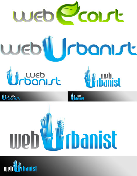
(Above Designs, Clockwise from Upper Left via: Pinoy Athena, iKnod, Mukhtar & Bloc)
Much of what we feature on WebUrbanist is the culmination of an artistic or designer process, but it is worth seeing that sometimes pieces of the process itself is as creative, compelling and eye-catching as the final product. Webist Publishing (WebUrbanist & WebEcoist) is currently engaged in a remarkable design contest, of which the end result will be brand new logos for both sites!
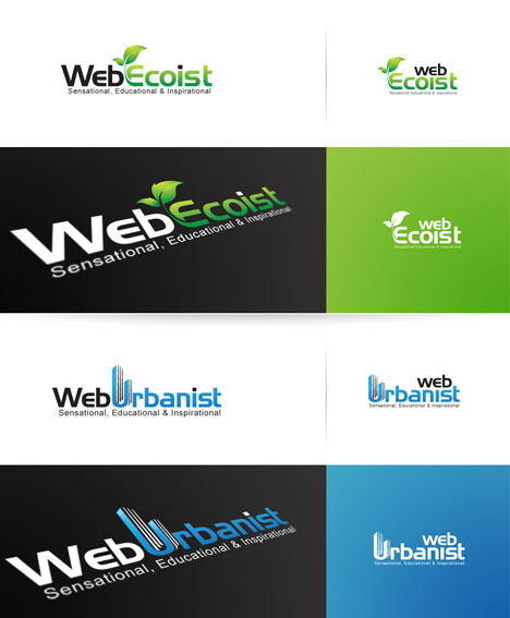
As exciting as this is, the various submissions to 99designs (like the simple-but-evolved series of designs by sixsixsix above) are equally or more so – they show an extremely impressive range of unique logo design work – even if only one can win in the end. See some of the best below and if you like their work, remember: you too can run a 99designs competition for a logo or other designer needs (and crowd-sourcing is so chic!).
One approach has been to create a separate-but-integrated iconography – identity through a symbol that is either directly or indirectly tied into the text of the design. In some instances, the more graphic-oriented portions are similar in scale and tone but different in color, details and other features while being similar in overall font and style – straight versus curved, rectilinear versus circular and so forth. The first pair above was produced by jminig and the second set was created by bobot.
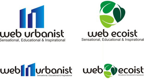
The kinds of designs discussed in the previous paragraph raise an important core question about iconography, symbols and text. Some designers tackled potential approaches head on with variants of each type – such as the above design sets by adbas in which the more graphic portions are either explicitly isolated or entirely integrated as letters.
Some ideas showed a particularly artistic approach, combined with a creative use of negative space. While they may be a bit too casual in some cases for these particular sites, they illustrate a great variety of design personalities in practice. In order, the above were designed by DemonAce, Pistacho and Asiku.
One of the most ingenious proposals using negative space (as well as positive) has been presented in two forms by KingFelix – a more horizontal continuous-text version and a stacked-on-top variant. One of the neatest aspects of this particular design is the way it uses similar overall strategies but differing details to define the logos through similarity as well as difference.
There are many ways that designs can evolve over time, as some of the aforementioned designs have already illustrated. In some cases, the process is not necessarily linear from ‘worse’ to ‘better’ per say – meaning: both the first and final product can be engaging in different ways, sometimes through simplicity on the one side and complexity on the other. JawsofSteel created these in sequence, but each is worthy of praise in its own right.
Last but certainly not least is the work of Marius Jivoin – the same talented individual who created the unique logo design you see on Gaijtz. His work manages to be a great combination of creative and professional – it is not overly artsy, but is also not stuck in the overly-corporate mode typical of many logo designers (who are, to be fair, used to working on more corporate projects).
