Nothing softens the harshness of the world wide web like a little watercolor. Whether used as a sheer splash of color on an otherwise minimalist website or as the basis of an entire web design, watercolor can be understated or bold, ethereal or grungy. These 14 websites are a showcase of artistic flair, with watercolor effects created both digitally and the old-fashioned way.
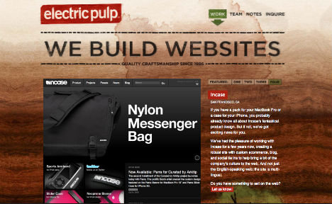
Electric Pulp
This web design firm advertises its services well with an eye-catching, visually dynamic and organic wood background and just a hint of watercolor effect at the very top and in a few details further down the page. A great example of beautiful balance in watercolor web design.
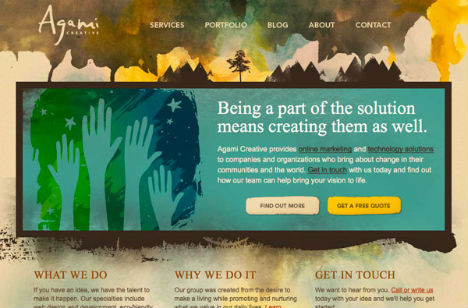
Agami Creative
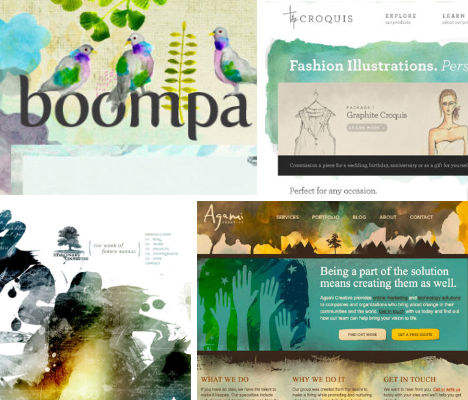
Appropriately enough for a firm with ‘creative’ in its very name, this website is bold and colorful, using watercolor as one of the main visual elements on the page. But even as loose and messy as watercolor can be, the overall design remains readable and cohesive with sans-serif typeface and a tight color scheme.
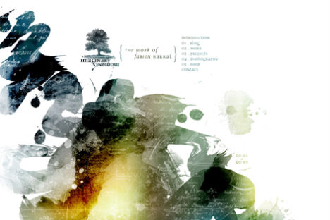
Fabien Barral
How else to set off a vibrant splash of watercolor but with plenty of white space? This is the older website of designer Fabien Barral, whose new website also features stunning watercolor effects. In both cases, the strokes of a watercolor brush reveal celestial imagery and text that is hidden in the white background.
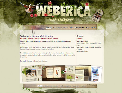
Weberica
Watercolor is often used on the web in two forms: organic, and grungy. The web design firm ‘Weberica’ combines both with a messy army-green background and illustrations of flowers and birds.
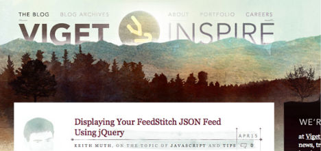
Viget Inspire
Web consulting firm Viget Labs uses watercolor in its most natural iteration – as part of a landscape. The mountainous, forested header image combined with sketches here and there – and plenty of white space to ease eye strain and provide room to breathe – is soft, yet fresh and modern.
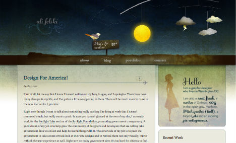
Ali Felski
Graphic designer Ali Felski’s website is not watercolor, per se. However, a gradient within the same color family, from deepest midnight blue down into bright white, provides a similar look to great effect.
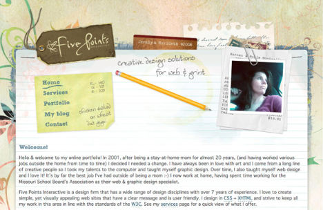
Five Points Interactive
The overarching theme of designer Jeralyn Merideth’s website? Paper. Notebook paper, memo paper, paper tags and yes, watercolor paper. There is no actual watercolor paint in the design, just a suggestion of texture and pleasing pastel colors.
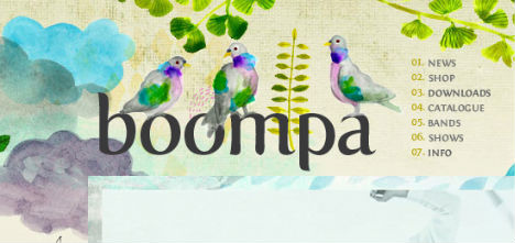
Boompa
Now here’s a website that really allows watercolor art to shine. The entire background is made up of watercolor images of trees, clouds, rain, birds… nature, essentially. Just the right vibe for this independent Canadian record label.
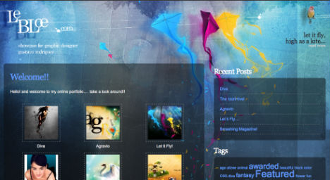
Le Bloe
Almost certainly, the ‘watercolor’ at LeBloe.com was created using a computer, but it’s no less effective, and the choice of watery blues and purples just intensifies the beauty of the effect.
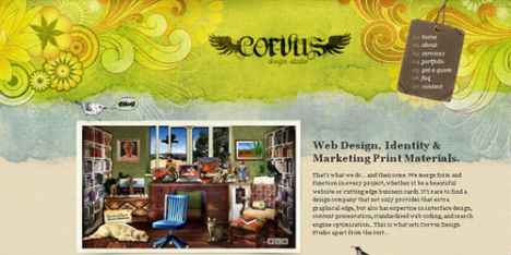
Corvus Art
The Corvus website is no stranger to design accolades, included in all sorts of web design lists, and with good reason. Designer Jessica Miller “gets a lot of her inspiration from wildlife, and wanted to incorporate her love of nature into her business life. This often shows in her design style, which has been described as ‘organic’ and ‘ethereal’.”
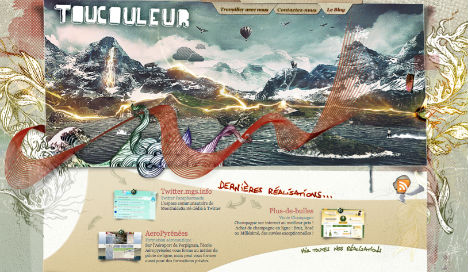
Toucouleur
Lovers of minimalist design may turn their heads in utter shock at the “busy-ness” of the Toucouleur website, but many others will fall in love with the carefree jumble of imagery which includes bits of watercolor here and there beyond all the photos, drawings, texture and decorative elements.
Washtenaw Community College
The Washtenaw Community College website is a great example of using just a touch of watercolor to enhance an otherwise simple design. The drawing that makes up the background of the main column on the page creeps upward in a tuft of blue sky and white clouds.
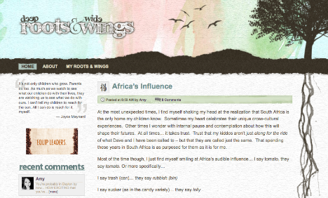
Deep Roots & Wide Wings
There’s something grounding about the use of paper-inspired imagery on the web. A blog called ‘Deep Roots & Wide Wings‘ features a soft splash of watercolor but also the edge of a piece of watercolor paper, carefully torn to suggest the shape of hills.
The Croquis
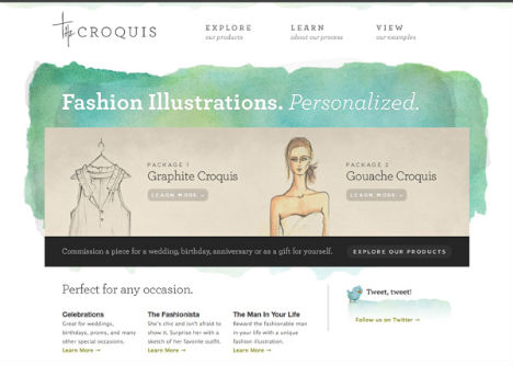
‘The Croquis’ – an online portfolio of fashion illustrations – is a minimalist version of watercolor on the web, perfectly suited to the subject matter but using just one colorful watercolor element against a stark white background for a subtle yet somehow still dramatic effect.
