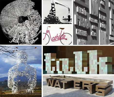
Typography is traditionally a rather flat pursuit: letters on a page, as beautifully designed as they may be, are still just two-dimensional images. But a growing number of artists and designers are bringing typography off of the paper and into the real world. These incredible works of physical typography span fine art, furniture design, public art and even home décor, bringing the intangible nature of languages into a touchable three-dimensional world.
Marc Ruygrok
(images via: Marc Ruygrok)
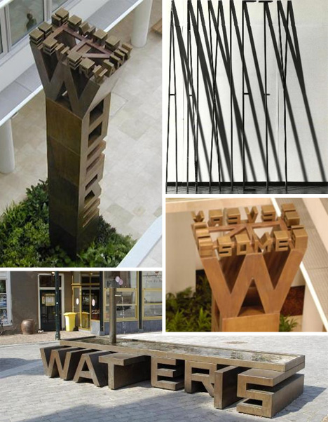
In the area of typographic sculpture, there is probably no designer more prolific than Marc Ruygrok. The Dutch artist has been constructing stunning type-based sculptures and installations since the early 1980s. His sculptures (mostly in Dutch, but some in English) can be found all over the Netherlands, many of them in public spaces.
Information Leak (Part 2) by Richard J. Evans
(images via: Richard J. Evans)
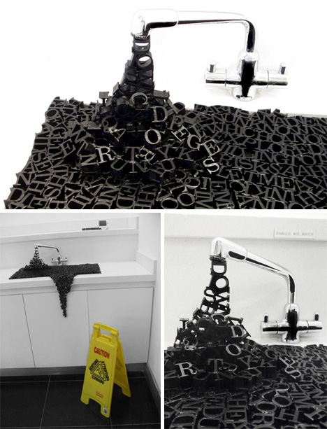
Laser-cut wooden letters spill out of a faucet, overflow a sink basin and make their way toward the floor in this graceful sculpture. Richard J. Evans completed Information Leak as his final major college project in 2009. The designer wanted to convey how easy it is for information to spill out unintentionally in the Internet Age, and how sometimes it almost feels like it’s pooling up all around us.
I Am the River by Jay Quercia
(images via: Jay Quercia)
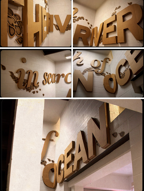
On white concrete walls, three-dimensional cardboard letters spell out “i am THE RIVER in search of AN OCEAN.” The beautiful complexity of the statement is offset by the simplicity of the brown cardboard words. Jay Quercia’s installation for the University of Connecticut reflects a feeling most of us are familiar with: being constantly in a state of change, always reaching for the next stage of life.
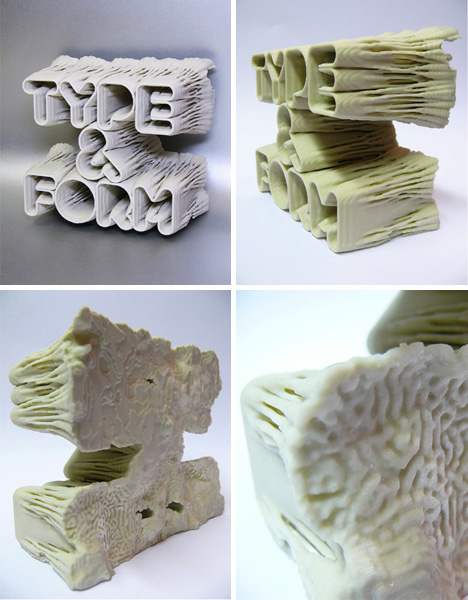
Type & Form 3D Sculpture by PostSpectacular
(images via: Karsten Schmidt)
London design studio PostSpectacular, headed by Karsten Schmidt, was asked to produce a cover for Print Magazine’s August 2008 issue. After using a complex system to digitally “build” the letters, Schmidt then turned his digital model into a physical sculpture with the use of a 3D printer. The result is a block of words that can actually be touched, held and manipulated. Read more about the creative and manufacturing process from PostSpectacular.
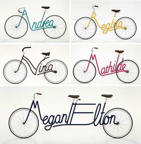
Write a Bike by Juri Zaech
(images via: Juri Zaech)
Designer Juri Zaech’s conceptual bikes feature frames that spell out the owners’ names. While maybe not the most practical or performance-driven bike design ever, it is certainly one of the most beautiful. Juri is currently looking for a way to produce a real, physical prototype of the clever bike concept.
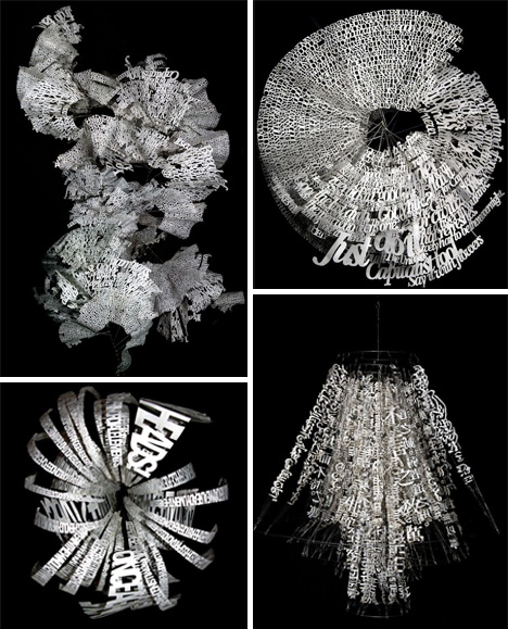
Word Mobiles by Ebon Heath
(images via: VisionWidget)
Brooklyn-based artist Ebon Heath feels that we are bombarded by information: visible, audible and intangible words surround us at every moment. His paper mobiles are made from jumbles of words that take letters and phrases off of the page, off of the billboards and storefronts, out of the computer monitor and mobile phone, and turn them into objects that can interact with our three-dimensional world.
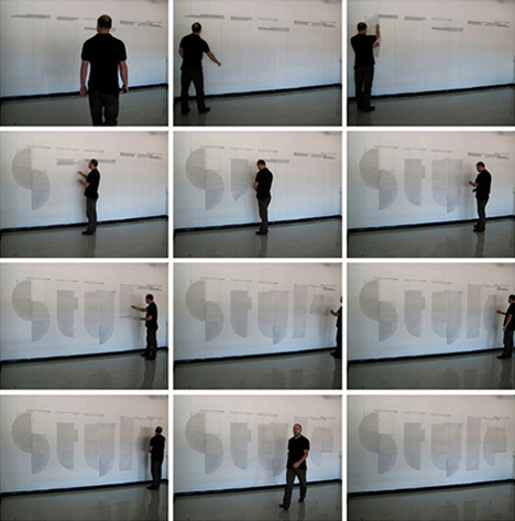
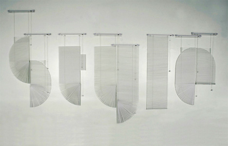
Venetian by Andrew Byrom
(images via: Andrew Byrom)
Accomplished designer and professor Andrew Byrom noticed that Venetian blinds, when pulled and shaped just so, could form the basis of an interesting font. Byrom, no stranger to coaxing letters out of unusual objects, tugged and tied eight sets of hanging Venetian blinds into the word “Style.”
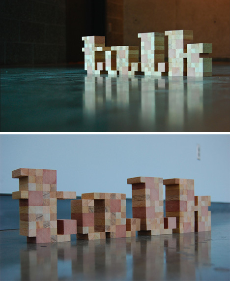
Talk by Andy Mangold
(images via: Andy Mangold)
Using a lovely pixel-based font he designed himself, design student Andy Mangold built the word “talk” out of nothing but sections of two-inch wooden dowel.
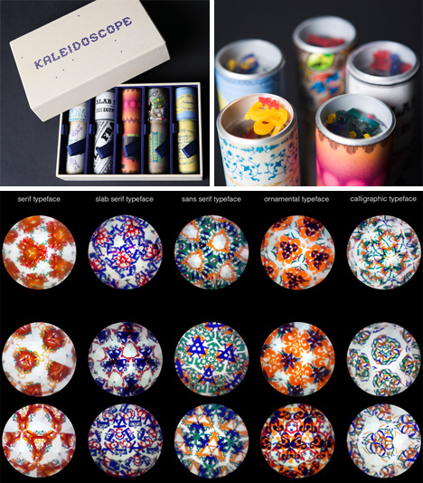
Typography Kaleidoscopes by Katerina Orlikova
(images via: Katerina Orlikova)
This student project was inspired by the interplay of light and typography. Katerina Orlikova used letters cut from colored transparent material to construct five kaleidoscopes that turned the very familiar shapes of letters into foreign and odd-looking abstract shapes.
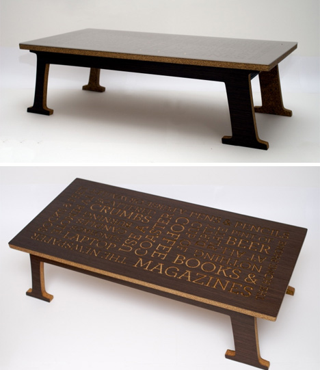
Coffee on Typography by Peter Haggard
(images via: Peter Haggard)
This clever table from designer Peter Haggard seeks to join typography and furniture in novel ways: by exploring what a table would look like as a letter, and by featuring clusters of CNC-cut words on top.
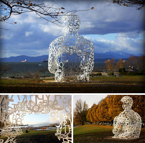
“We” Sculpture by Jaume Plensa
(images via: Jaume Plensa)
Sitting in Vancouver (from October 2009 to Summer 2011) is a strange and wonderful man: the We sculpture from artist Jaume Plensa. Designed for the Vancouver Biennale open-air art exhibition, the sculpture is made up of characters from several different alphabets that come together in the shape of a seated human. Visitors can walk inside the sculpture and surround themselves with letters, creating a one-of-a-kind art experience (and fantastic photo opportunity).
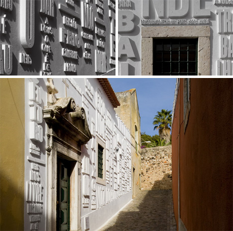
Vai Com Deus Façade by R2 Design
(images via: R2 Design)
This stunning building façade, blending typography and architecture, graced the front of a former chapel-turned-gallery in Lisbon, Portugal. Recalling the years of classical art when art was created for religious purposes, R2 decided to put religion into their design…in a way. The three-dimensional phrases jutting out of the wall are familiar sayings like “for the love of God,” “may God be with you,” and “when God closes a door, he always opens a window.”
