Ketubah
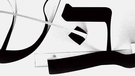
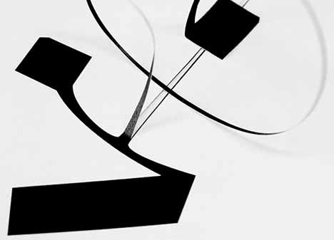
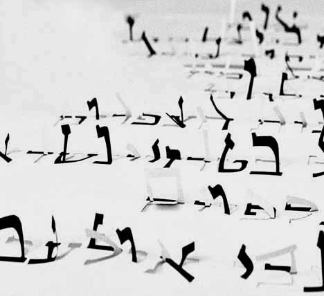
The Ketubah — a Jewish prenuptial agreement — is one of the predominant forms of Jewish art. Using a different typeface for each language appearing in this multilingual Ketubah — Hebrew, Yiddish, English, French and Spanish — Oded explored the traditional aspects of Hebrew and Latin typography to combine it with his own unique style.
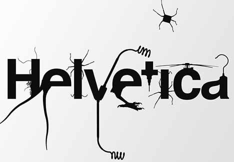
Helvetica
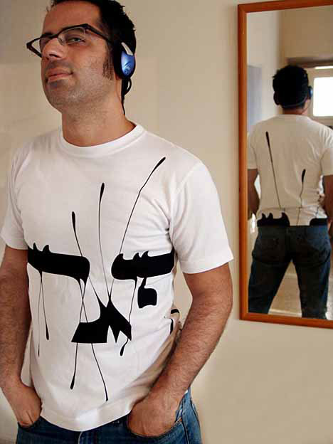
Oded’s formal intersections between the Helvetica letters and various object silhouettes to consciously ignore “logical” context was influenced by Dadaist methods and contemporary virtual hybridizations of animals and human beings.
Helvetica Live!
“These typo hybrids suggest a more playful and humorous attitude to typography, a field that often suffers from an unjust reputation of an overly strict and serious one.” says Oded.
Interview of Ezer’s Typography Philosophy
Oded Ezer doesn’t like being ‘typecast’ as a Typographer. “It’s like a garment I’m wearing.” he says. “I don’t like it but people do and so it’s necessary. Basically I’m working in two parallel paths. The first is the natural path of a working designer. I do everything I’m “supposed” to do to be successful. But this is so boring for me; I’m not cut out for that.”
From the Contemporarytype series
“The other path is the frightening one, ‘the unknown,’ and very difficult to maintain. I don’t have a name for it. And to me, this is what being a designer is all about.”
Working from his home Givaataim –a suburb of Tel-Aviv — Oded says most of his work doesn’t come from tradition of graphic design or typography. “My work does not come from the Israeli graphic or artistic culture. The people who influence my work are musicians, biologists, scientists, not necessarily designers.”
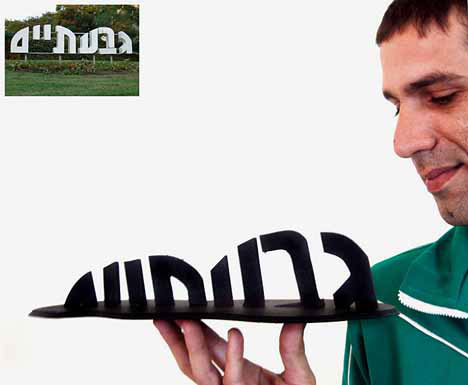
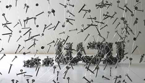
“Mini Givatayim” typographic sculpture which roughly translates as “Two Hills.”
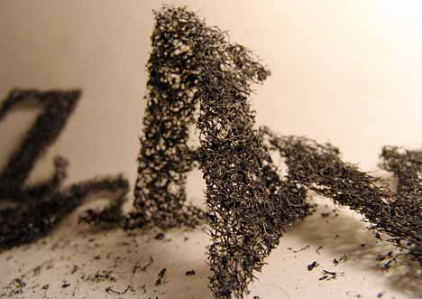
“In my approach I’m trying to view everything that comes from letters as typography. I’m trying to investigate the new media into which typography can develop. In the Biotypography example, typography relates to the body, to bodily deformation or cloning.”
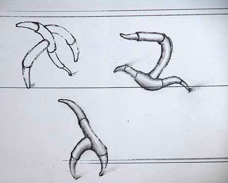
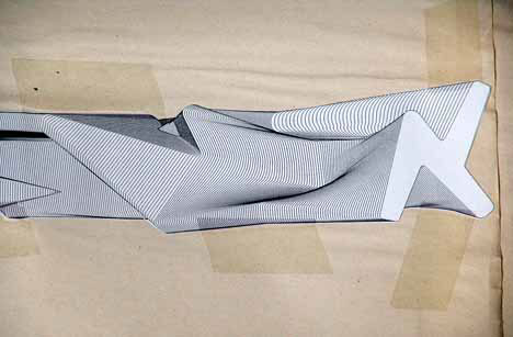
“I work a lot with my hands and I make small models and I take pictures of three-dimensional sketches.”
Image from Oded Ezer’s typo art sketchbook.
Image from Oded Ezer’s typo art sketchbook.
“In most cases, when people (designers or otherwise) come across my work, they say two things: ‘it’s amazing,’ and ‘I don’t understand this.'”
“I have no idea what I’m doing, and I don’t care. I open doors and whoever wants to enter is welcome.”
In his quest for new forms of typography, it takes Oded anywhere from a month to a few years to create a new font.
The Message
“A letter is both the content and the object that carries it. Is it a “thing” or a “symbol of a thing?” Or both? I relate to these places because for me, when I make a hairy circle, it is a hairy circle. But if I write the word “circle” in a hairy way, it opens up a whole new field for interpretation.”
“And this is what I like about typography. This is why I’m a typographer. I love hating the letters, love them, betray them or be loyal to them. It’s a toy store.”
“I hope the audience will be exposed to the ideas and to the philosophy of typography in a different way.”
About Oded Ezer
While working as a commercial graphic designer as a profession, Oded Ezer also runs experimental typo / art projects for which he explores non-conventional solutions in Hebrew typography, receiving global attention and fame for his posters and graphic works which have been showcased and published world-wide.
Oded Ezer
The 36-year-old Israeli artist is not only a typographer, but a type designer and lecturer as well, teaching typography and graphic design in several academies in and outside Israel, including the Shenkar College of Engineering near Tel Aviv, the Wizo College of Design, Haifa, and the college where he graduated from at Bezalel Academy of Art & Design, Jerusalem, with a Bachelor degree in Visual Communication Design in 1998.
Oded founded his own independent studio “Oded Ezer Typography” in Givatayim, Israel, in 2000, and co-founded the first cooperative of Israeli font designers called “Ha’Gilda” — translated as The Guild — In 2002.
His local and international awards include:
* Gold Prize at the international design competition of the Nagoya Design Center, Japan (2000)
* Certificate of Excellence at the 4th annual competition of the New York Type Directors Club (2001)
* Certificate of Excellence at the “Bukva raz,” a type design competition, Moscow, Russia (2001)
* Israeli Education Ministry Prize for Design (2003)
“I feel like in that story of the old man, who holds a flower in one hand, and a piece of bread in the other — the bread is to live and the flower is something to live for.”
The Finger – Oded Ezer
All photos property of and copyright Oded Ezer
Sources: Oded Ezer, R. Wanner Poster Page, and idCast
