Fries With That?
 (images via: About.com, iDrive Orlando and Cyburbia)
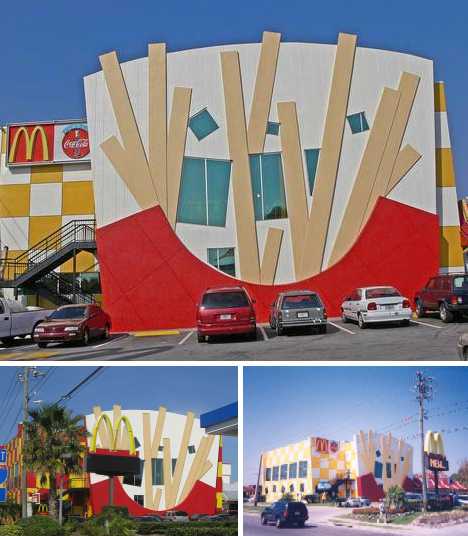
Only in the hometown of Disney World might one find a McDonald’s designed to look like a box of really, REALLY supersized french fries.
 (images via: Paxton Holley)
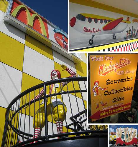
This Orlando restaurant bills itself as “The Largest Unique McDonald’s in the World”, which slightly differentiates it from other pretenders that share their space with non-McDonald’s retail endeavors – we’re looking at you, Vinita, Oklahoma location.
 (image via: SC Mike Burton)
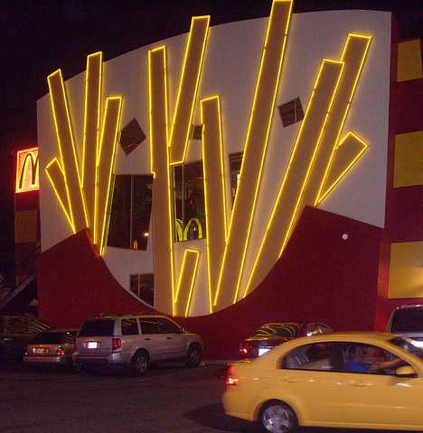
The McDonald’s located at 6875 Sand Lake Rd. in Orlando isn’t satisfied just by being big, bold and bright by day – when the sun goes down, the neon lights come on and the, er, side of fries glows and buzzes in the Florida night.
Chattanooga Chew-Chew
 (images via: Maestro Gaxiola and Art Thou?)
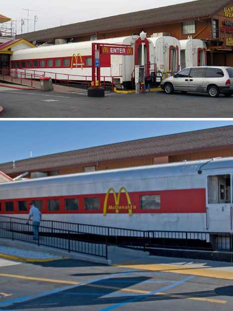
Barstow, actually, and the Barstow Station McDonald’s to be exact. It’s doubtful any other fast-food train, er, chain would refurbish a few Pullman railcars and repurpose them as dining rooms. We’re not sure WHY McDonald’s did this but they must have had some motive… maybe a loco motive.
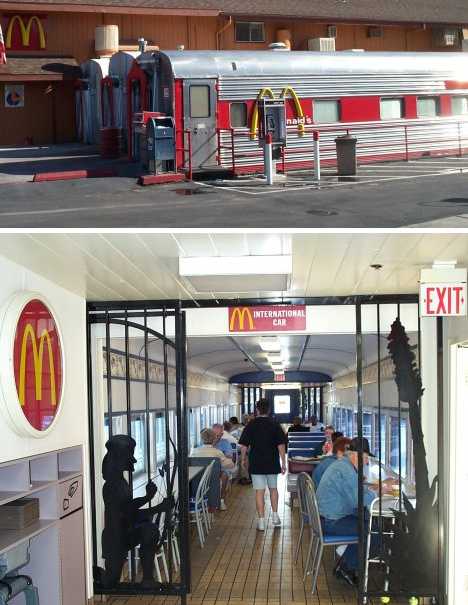 (images via: Niffguard)
Barstow, California has a long and illustrious history as a transportation hub for both road and rail – Route 66 being the most noteworthy of the former. You can still get your kicks on Route 66, and while you’re at it you can have your burgers, nuggets, fries & pies in the historic comfort of the Iron Horse.
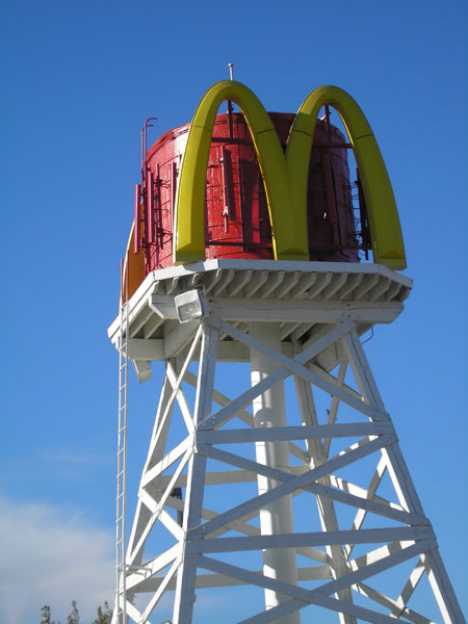 (image via: Legends of America)
Note the finishing touch to the Barstow Station McDonald’s: a former elevated railway water tank that now does double-duty as a sign advertising McDonald’s and a cell phone tower.
Done Right Down Under
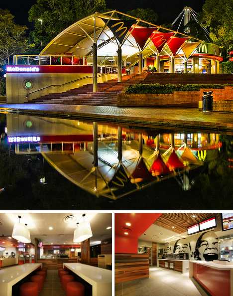 (images via: Assaf_F and Interior Arcade)
Hire a design firm named Juicy and you can be sure the finished product is anything but staid. Case in point: the Strand location McDonald’s on George Street in Sydney, Australia. If this is what redesigned McDonald’s look like, I’ll not only eat there, I’ll LIVE there!
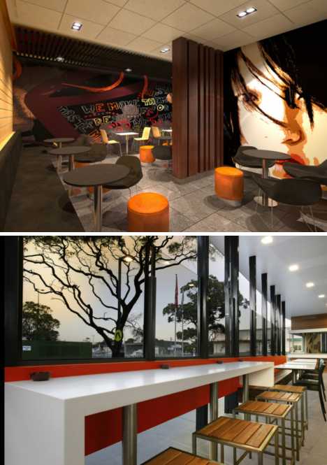 (images via: Interior Arcade)
Patterned wallpaper unique to each location and custom fittings that would appear more at home in, well, a home make Sydney’s redesigned McDonald’s restaurants an aesthetic tour de force. How’s McDonald’s new look being received? Do you really need to ask? Juicy has been asked to “work their McDonald magic around the globe,” and that’s a good an answer as any.
Imperialism, Supersized
 (images via: Ikaink, Dr Abbate and Wikimedia)
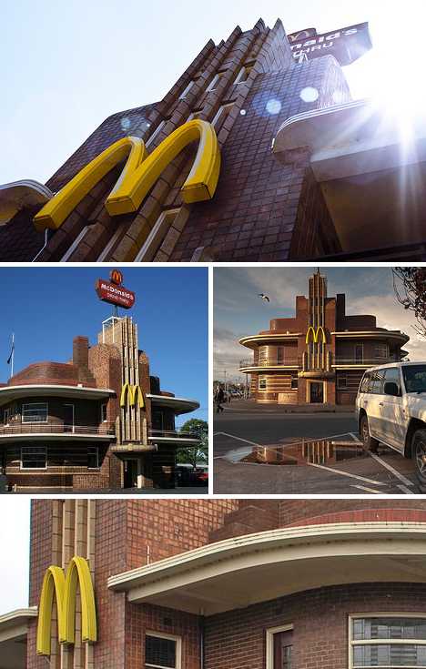
Is the McDonald’s in Clifton Hill, Melbourne, Australia “the most beautiful McDonald’s in the world”? Architecture’s appeal can be a subjective thing but there’s no denying the converted United Kingdom Hotel dating from 1937-38 is distinctive regardless of its current function.
 (images via: Dr Abbate and Goldfish/Panoramio)
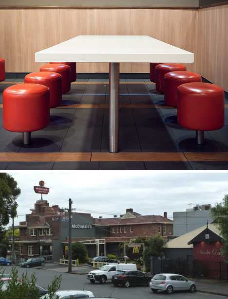
The Clifton Hill McDonald’s looks cool and retro-chic on the outside; the art deco theme extends to the inside as well. Those who’ve nipped in for some tucker report the service counter looks much like any other McDonald’s but the seating areas add a dash of diner style along with bright primary colors unlikely to have been found in the original pre-war hotel’s dining room.
 (image via: Ikaink)
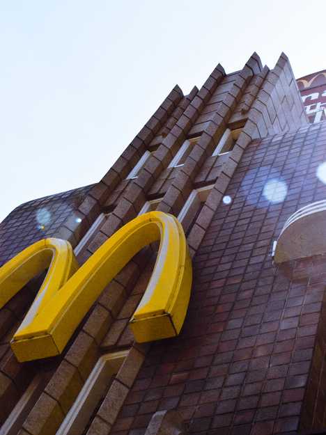
Designed by architect James Hastie Wardrop, this art deco masterpiece suffered very little modification in its transformation from Imperialist outpost to corporatist outlet. In fact, McDonald’s was praised for their decision to maintain the original building’s unique, sculptured structure while restoring those portions that had suffered decay over the past 3/4 of a century.
Drive-Thru Back to the Future
 (images via: SterlingDavisPhoto and San Fernando Valley Blog)
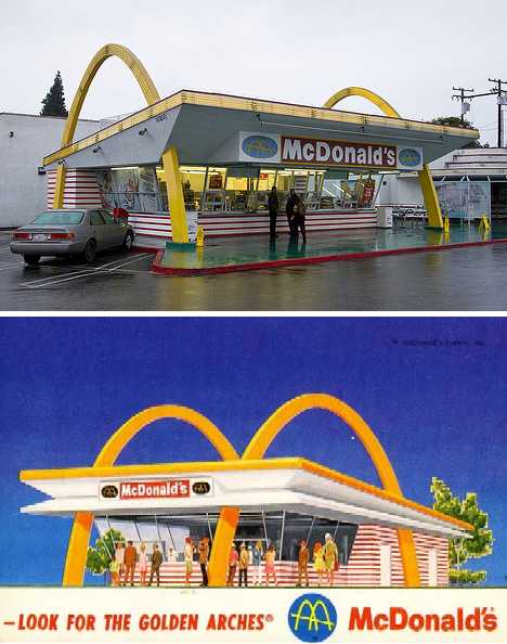
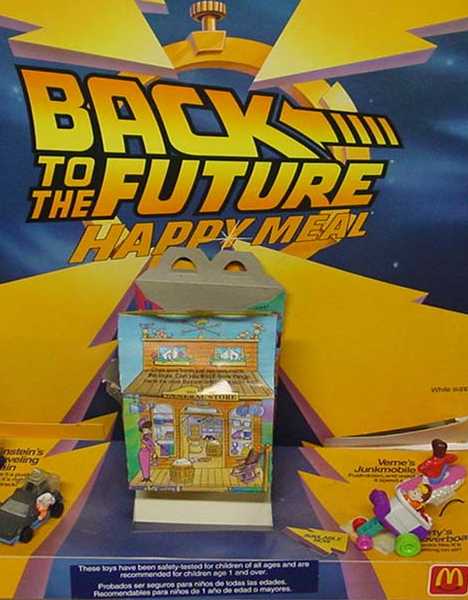
The first McDonald’s restaurant opened in 1940 but the present multinational corporation traces its roots back to 1955 when Ray Kroc (not Marty McFly, sorry) opened his first franchised McDonald’s restaurant (the ninth overall) in Des Plaines, Illinois.
 (image via: Time Machine Toys)
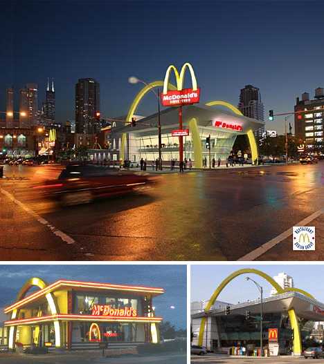
Considering the many changes McDonald’s architecture has gone through since then, it’s surprising to see some of the original Fifties vintage restaurants still operating in situ and still looking fabulous.
 (images via: A Daily Dose of Architecture and RoadsideArchitecture.com)
It may be even more surprising to see McDonald’s returning to the original style of these restaurants, typified by the twin golden arches incorporated into the restaurants’ structural design. Even the gargantuan, double-decker McDonald’s that replaced the former Rock N’ Roll McDonald’s in River North, Chicago espouses the new/old design philosophy. Prices may not be what they used to be but McDonald’s arches, at least, are still golden oldies.