Bubble Wrap Typography
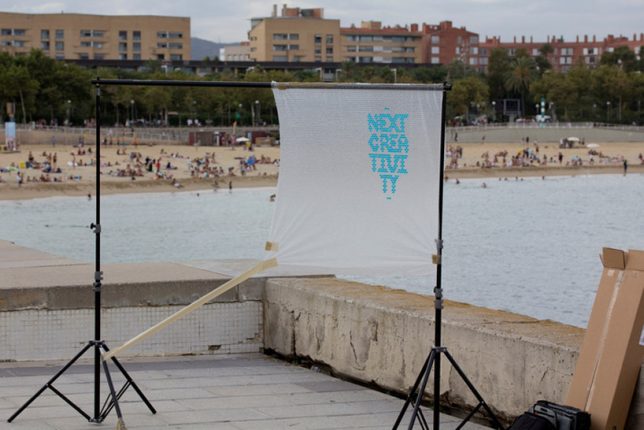
Low-tech and yet highly creative, this project by Spanish design studio Lo Siento injects colored water into bubble wrap blisters to spell out ‘Next Creativity’ for the cover of Japan’s +81 magazine.
Alphabeard
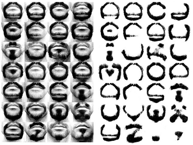
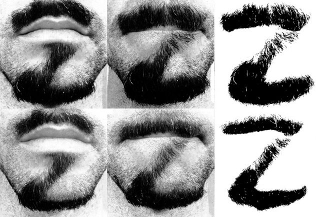
New York-based designer Michael Allen grew and re-grew his beard at least 26 times just to shave portions of it off and capture a photo. ‘Alphabeard’ is the result. Allen isolated the letter-shape beards on a white background to turn them into an actual, cohesive typeface.
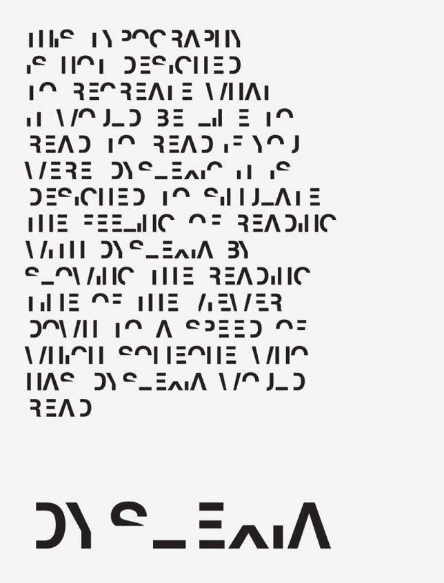
Dyslexia Typeface
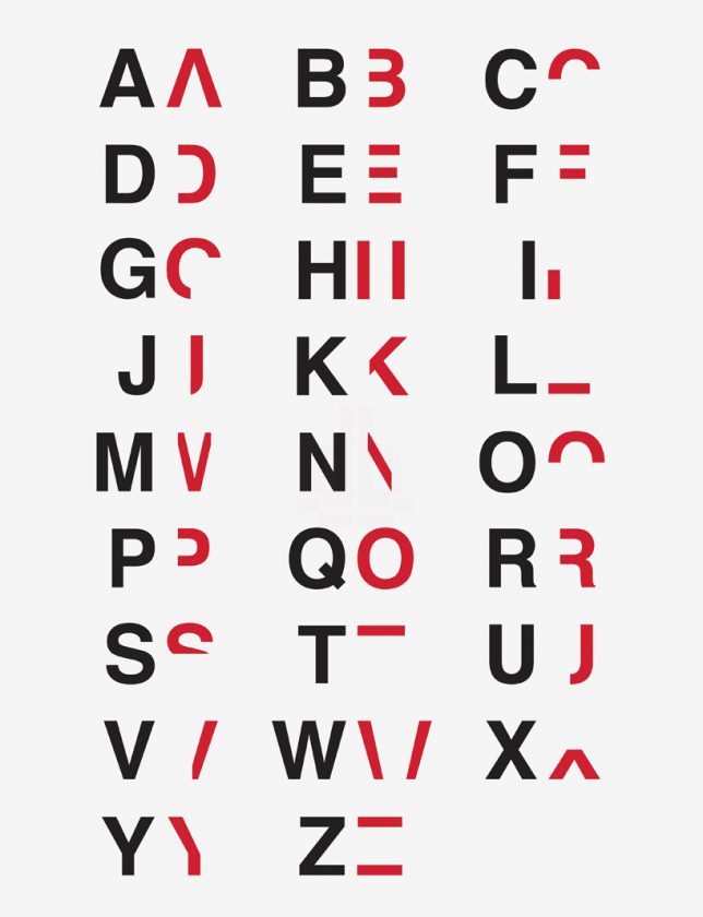
The point of this alphabet isn’t to make written text more easily readable for people with dyslexia; in fact, it’s quite the opposite. British graphic designer Daniel Britton, who deals with the condition himself, wanted a visual way to help non-dyslexic people understand just how much of an effect this difficulty in processing linguistic and symbolic codes can have on daily life. His ‘dyslexia’ typeface slows down the average reader’s comprehension to roughly the same as that of someone who struggles with the issue.
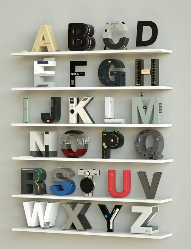
Electronic Alphabet
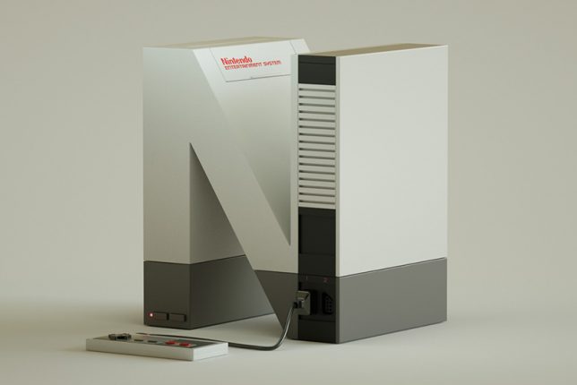
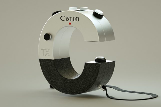
N for Nintendo, A for Apple, C for Canon, T for Technics. Designer Vinicius Araujo brought technology and type together for the ‘electronic alphabet,’ illustrating iconic brands and some of their most well-known products (in Helvetica, naturally.)
Letters Interpreted as 3D Objects
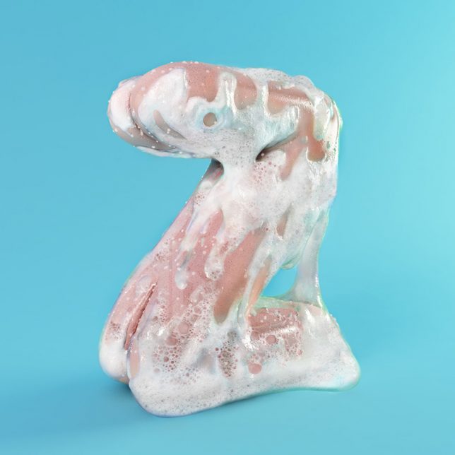
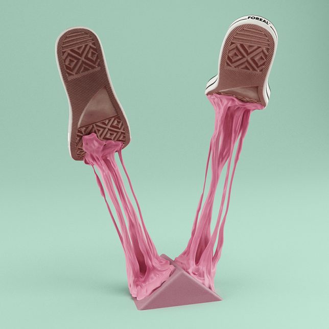
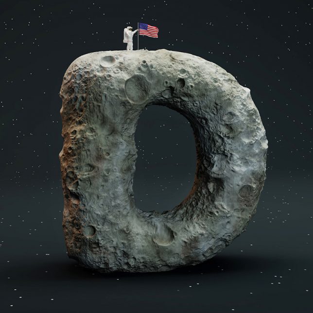
3D digital ‘sculptures’ capture each letter in physical form, from candy bars to tentacles to questionable body parts, in this fun illustrated alphabet by German creative studio Foreal. Often commissioned to create ads and mastheads, these designers love to play with lettering. “Our goal was to create the whole alphabet and achieve some completely new ways how type can be built and seen,” they say. “A playful execution of that self-initiated project helped us to gain some signifiant experience in CGI sculpting techniques while having a lot of fun.”

