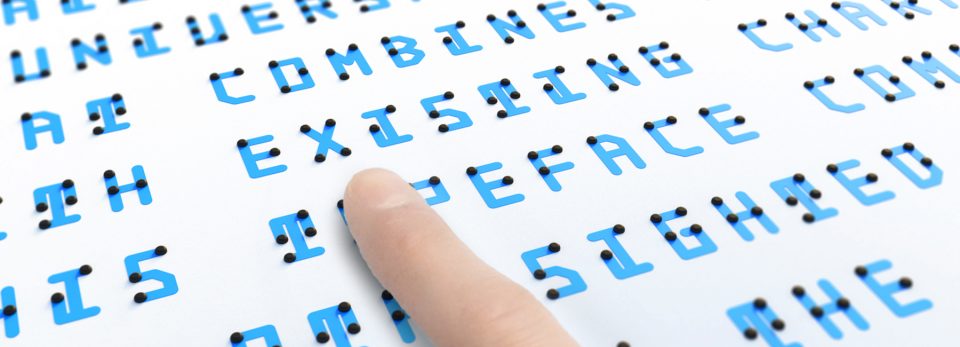
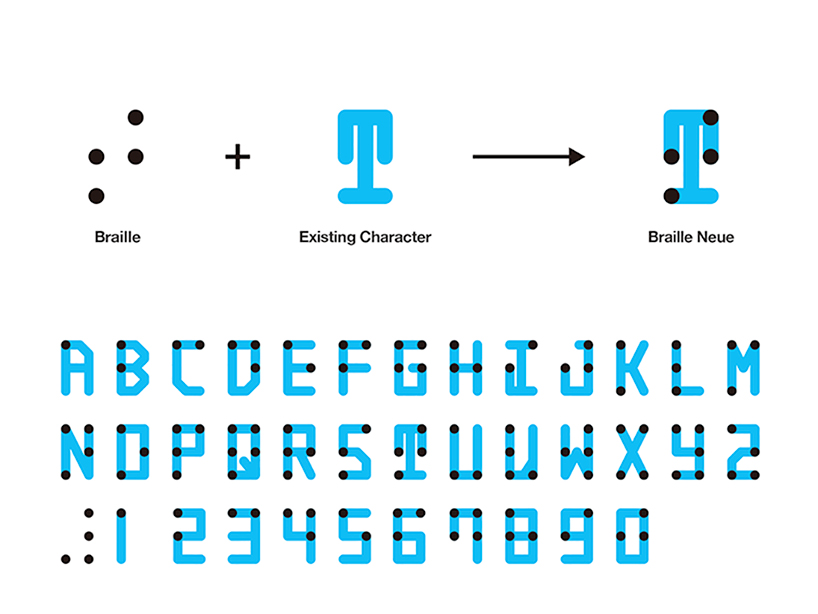
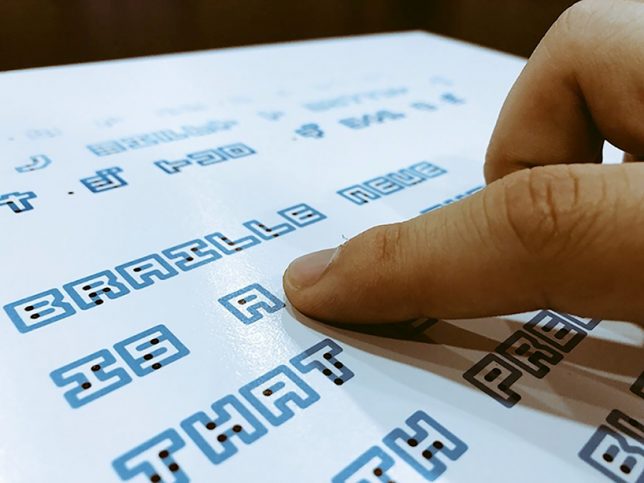
Braille type is often included as alongside conventional letters, but “Braille Neue” typesets blend both visible and tangible characters in the same space, creating hybrid alphabets that anyone can read. Developed by designer Kosuke Takahashi, the solution is simple and elegant, giving equal priority to both sighted and visually impaired people.
The trick, essentially, is to use the two-by-three point layout already employed in the braille alphabet as a framework for the overlapping visual text. As a secondary effect, the visible overlap helps educate those who can see it about braille equivalents.
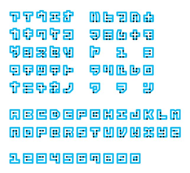
Takahashi has developed both Japanese (Braille Neue Standard) and English (Braille Neue Outline) variants. Theoretically, these could also be used to “print over” existing texts — as in: lay ink over braille or even vise versa in some cases.
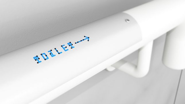
Specifically, though, the typeface’s creator hopes this solution will be employed in signage for the Tokyo Olympics and Paralympics in 2020. After all, those represent a time and place designed to bring people together.
Braille is named after its creator, Louis Braille, a Frenchman who lost his sight as a result of a childhood accident. In 1824, at the age of fifteen, he developed a code for the French alphabet as an improvement on night writing. He published his system in 1829. The second revision to this touchable type system, published in 1837, was the first small binary form of writing developed in the modern era.
