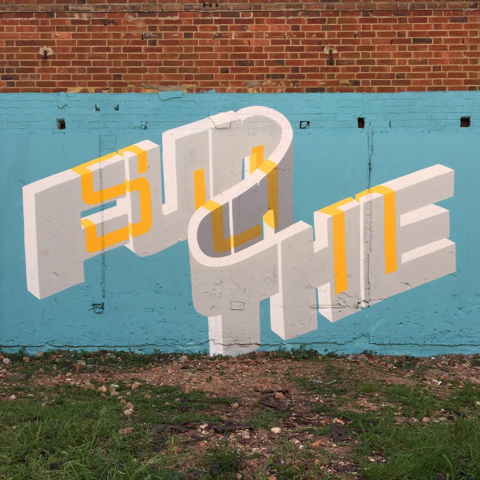
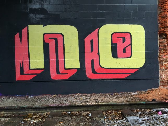
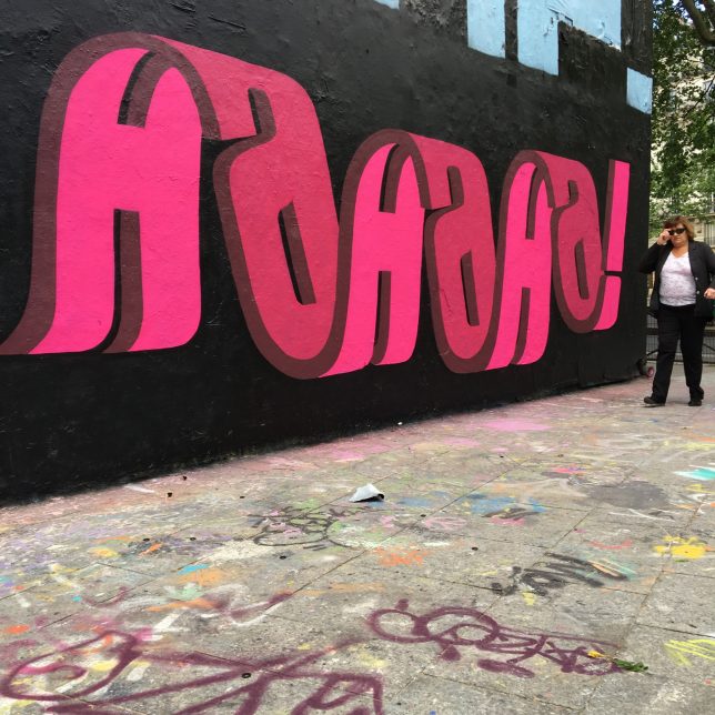
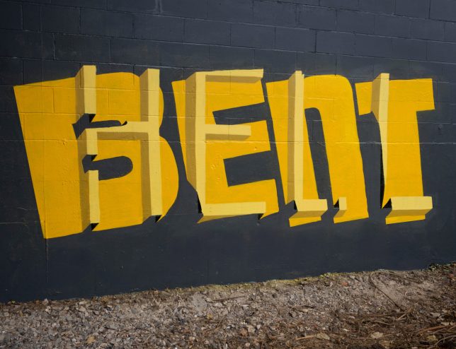
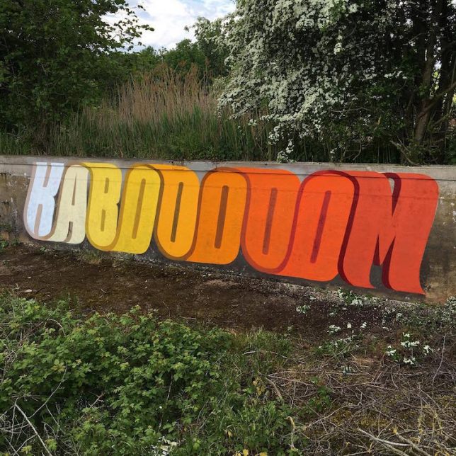
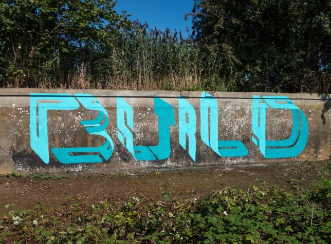
Warping classical fonts into rich mural art, Peter Preffington (or: Pref) uses three-dimensional complexity to draw the eye to deceptively simple messages.
A veteran street artist, Pref has “always been interested in the idea of graffiti speaking to the general public,” and has “pushed and experimented with this idea of overlapping words, seeing how many I can fit into the space of one word, and then slowly boiling it down and simplifying this idea to become more legible.”
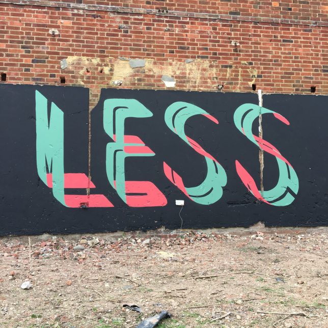
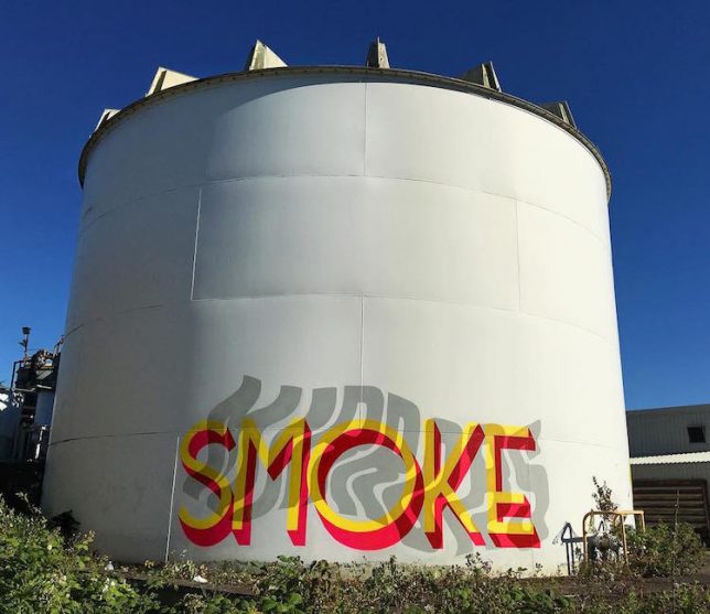
Some present as simple on the surface, but reveal other words (often related via a known phrase) upon inspection — “more,” for instance, lurking within the word “less.” a “smoke” and “mirrors” takes some time to decipher as well.
The works are designed to be figured out, but also use positive and negative space in creative ways, unfolding like a visual puzzle. In a way, this is both typical of tags, which can be hard to make out, but also a break from tradition in that they are crisp, clear and made to be understood.
By writing in a more comprehensible way, Pref aims to make his work more accessible to the public, opening up a wider audience to the appreciation of type-based graffiti art in shared spaces.

