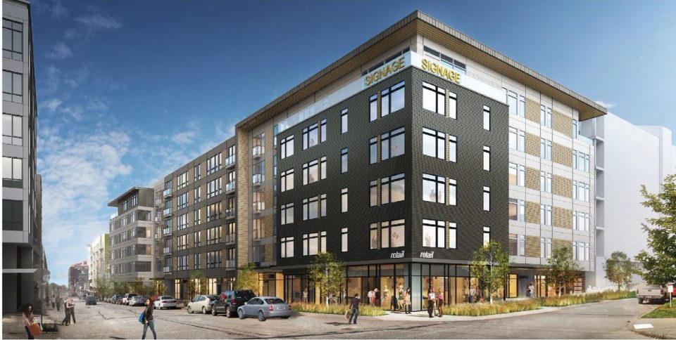
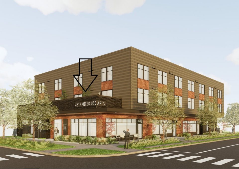
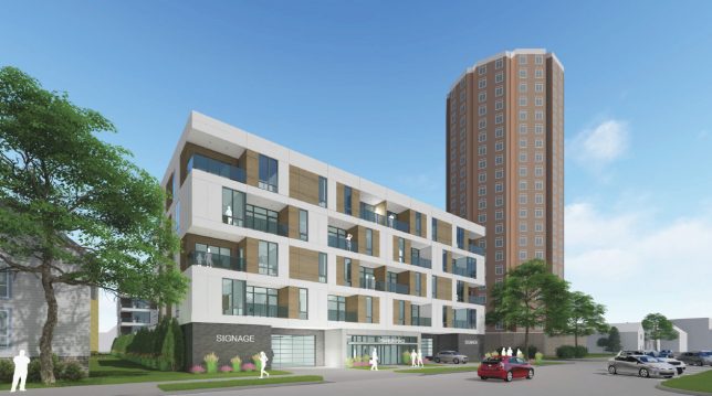
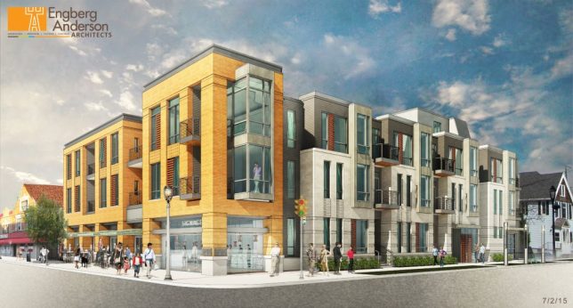
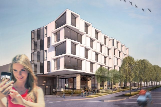
Architects are sometimes criticized for taking creative liberties with their artwork, setting unlikely green scenes or populating their rendered scenes with an improbable array of happy figures. While these “literal renderings” (per Mike Rosenberg) may in some sense be figurative, using signage one would not likely see on an actual structure, they also are refreshingly blunt about the contents of the structures represented.
Surely, no one will actually call their store “Retail” or building “Signage” or mixed-use community “Mixed-Use Apartments,” but at least the viewer gets an actual sense of what they should expect to find inside.
In some cases, these are generic elements are simply temporary markers for mid-stage designs without a name — in others, they can be used to pitch developers, communities and local approval boards.
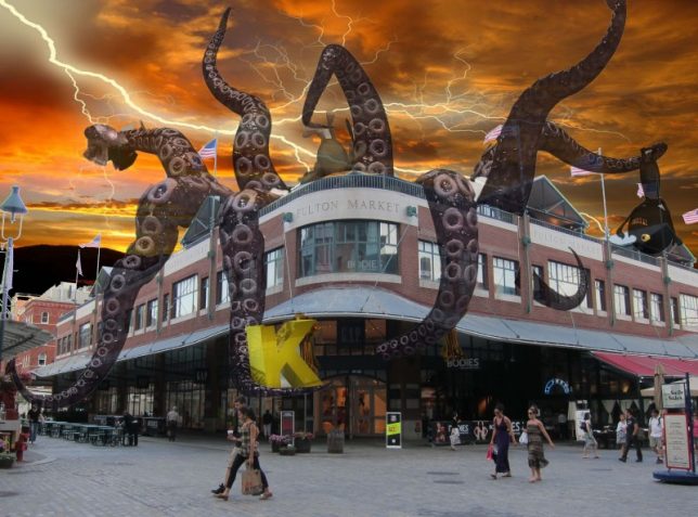
A kind of architectural equivalent to plain-packaging, minimalist companies (like Brandless), these exist at the other end of realism spectrum, countered by more playful and surrealist approaches like the one below.
The art of architectural representation has changed a lot over time, including the scale figures used to set stages, but at least these kinds of experiments show there is further room to adapt and grow.
