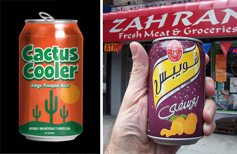
They provide a much needed dose of caffeine, and fit comfortably in a hand. As iconic as the drinks they hold, the soda can has become the standard for soda storage. Soda cans are so common that we rarely take a second glance at them, until now.
(Images via lovelypackage, notcot, behance, designflex, smh)
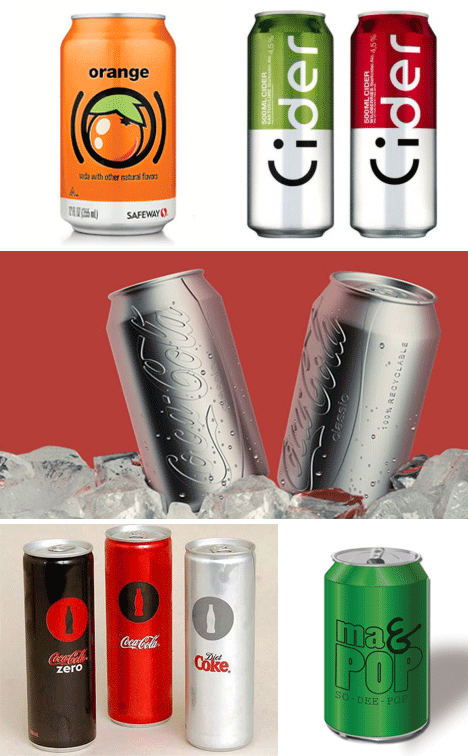
Most brands try to put as much information as possible, in as many places as possible, slathering their messaging across every open space on their product’s packaging. It’s for this reason that a minimalist design is so appealing. If the major brands knocked it down a notch, the purchasing public would no doubt be pleased with the results.
(Images via psfk, ivman, vizeer)
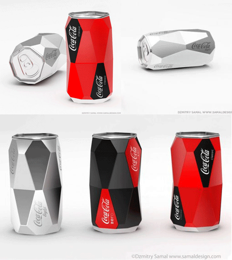
Almost everyone has had a can roll away, sloshing and shaking its fragile contents with an explosive result. One intrepid design student has taken this into account, and came up with a design that is both anti-rolling, and visually stunning. Talk about futuristic!
(Images via brandflakesforbreakfast, rft3, thedieline, bannerblog, sundancechannel, coinnovative)
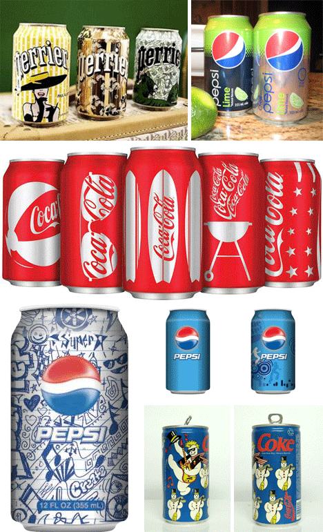
It’s always neat when the brands we’re so used to decide to switch up their designs for a limited edition run. Here are some fun and cool examples, many of which look even better than the original packaging.
(Images via mergevisual, eatingintranslation)
A fine mix of minimalism and great design can make a soda can just look… nicer than other ones. It’s surprising how awful some soda cans look, considering the product is the packaging.
(Images via sundancechannel, liquidinspiration, inspirationspam, mikekrol, lushlee)
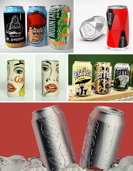
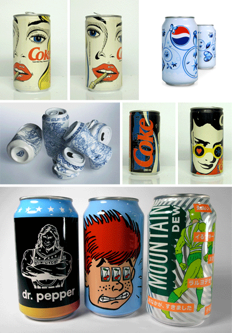
When artists turn to a new medium there are often awesome results. These soda cans are no different. From the truly unique porcelain china crushed cans, to the entertaining comic and pulp inspired designs, it’s great to see some people having fun with designs (even if they’re never produced).
(Images via trendoriginal, briankaneonline, newtech-news)
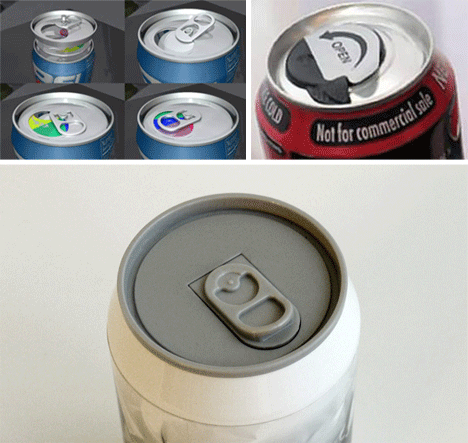
For true can lovers, their nemesis, the bottle, has one major advantage: they can be resealed. There is hope for the can, however, as future-looking inventors attempt to create soda cans that can easily and cheaply be set aside and saved for later.
(Images via popsop, tonic, epromos, niceshoes)
Some designers like frenetic, flashy designs, and they tend to work quite well with soda cans. Since soda cans are for the road, it makes sense that an action packed and glitzy can would fit the theme.
(Images via toyqube, toyqube)
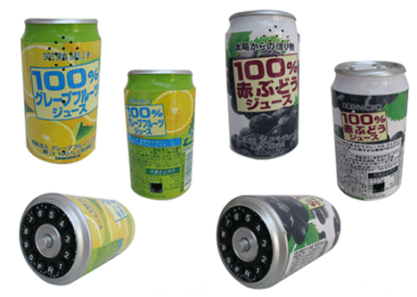
Currently just a novelty phone in Japan, maybe a similar design will be the phone of the future. One could keep their daily dose of caffeine on hand, and talk while they sip!
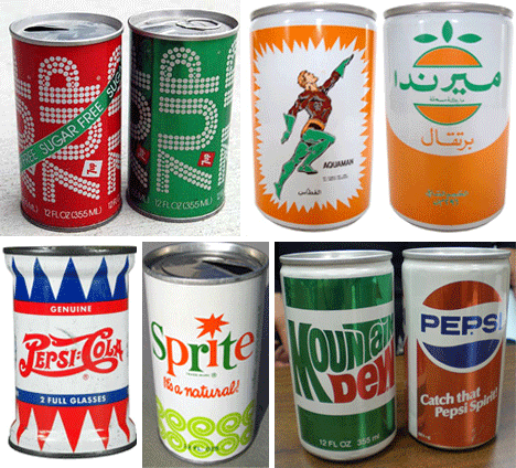
(Images via 248am, aquamanshrine, seriouseats, pzrservices, antiquetrader)
Anyone who has seen the throwback soda cans appearing in stores, understands how drastic a change soda can designs have gone through over the years. While some of the older designs are unattractive, overall they tend to be quite a kick.
