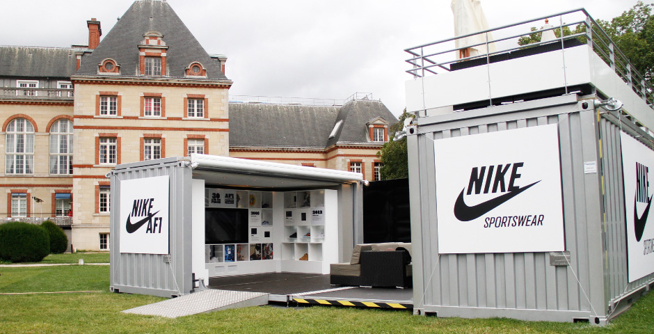
The temporary nature of pop-up shops seems to inspire a bolder, braver, more experimental approach to retail design, encouraging architects to make use of unexpected materials and play with shoppers’ perception. The resulting spaces are undeniably dynamic and often interactive, grabbing our attention so effectively, it’s wonder we don’t often see permanent stores this creative.
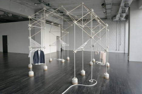
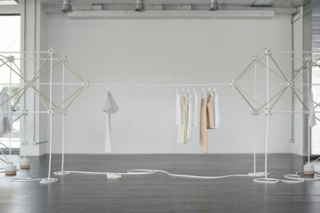
Minimalist COS Shop by Bonsoir Paris
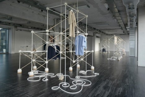
A simple framework system of joints and rods comes together into a geometric installation that serves both as racks for the clothing being sold, and a visual contrast within the stark space. The fuss-free yet graphic style by Bonsoir complements the simple lines of Swedish fashion label COS.
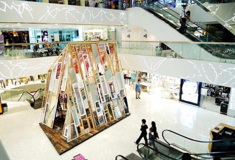
MOMO Recycled Pop-Up By Andy Tong
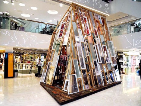
Made entirely from recycled and reclaimed materials like wood, windows, bubble wrap and mirrors, this pop-up by Andy Tong for MOMO attracts attention in the center of a Hong Kong mall. The designer wanted a temporary space that would stand out against the comparatively sterile corporate identities of the mall brands.
Modular Wood Pop-Up Shop for COS
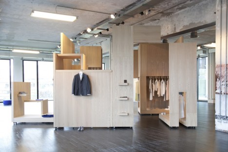
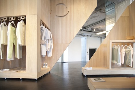
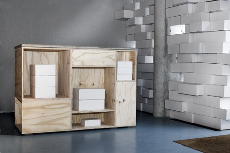
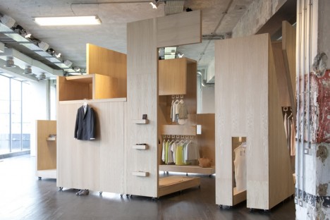
A series of modular wooden elements come together to form a room-within-a-room reminiscent of studio apartment pods where everything you need is cleverly packed into one tiny space. Another creation for Swedish retailer COS, this pop-up for the Salone del Mobile furniture fair has a cozy feel, drawing in passersby without overshadowing the goods themselves.
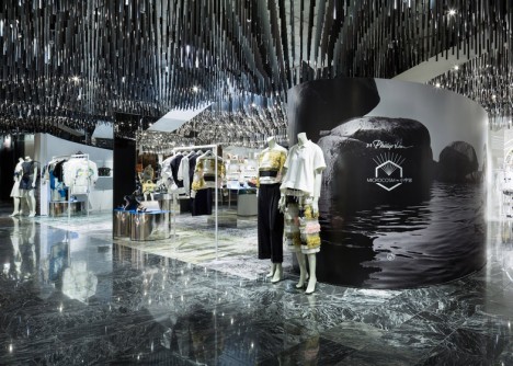
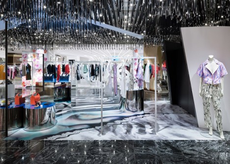
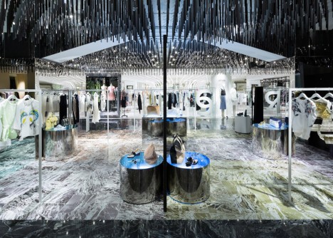
Mirrored Philip Lim Pop-Up by Schemata Architects
Schemata Architects play with reflection and symmetry to create a disorienting environment where you’re not sure what’s real and what’s illusion. Designed for fashion label Philip Lim, the space features needle-like pendant lights dripping down from the ceiling, glass-topped illuminated plinths and large mirrors facing each other.
